


Scarier than Darth Vader
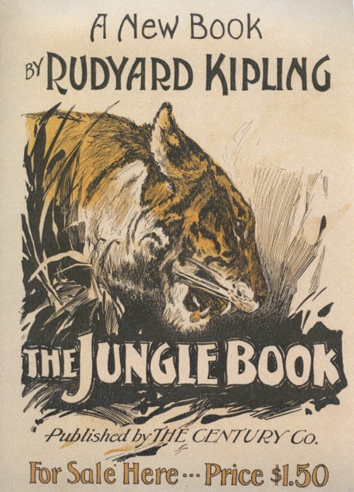 I have never read Kipling’s The Jungle Book. Like many though, I have seen the Disney animation. It was one of the first films I saw; reading a little about the synopsis makes me realise I retain absolutely no memories of it. What I do remember is being very cross because my sister made me go and see that instead of the original Star Wars with her and my cousins, citing that I was too young for violent science-fiction. (I was even crosser when I saw a boy about my age exit the cinema, having seen it and clearly suffering no ill effects.) But however childish I thought it was, I am sure I must have enjoyed The Jungle Book.
I am amused to compare some stills from the film with the cover art of this nineteenth century publication. That tiger looks scarier than Darth Vader. Compare its animated counterpart:

Cuddly, right?


I think I need to take a trip down memory lane and rewatch some of these childhood perennials.
This may be the last calendar picture I share for a while, as I recently found a vintage perpetual calendar in a thrift store, and plan to try using that next year. I rarely write on the actual wall calendar, using my phone diary as a planner, so it seems a little pointless to have one, apart from enjoying the pretty pictures every time I turn a month over. I expect I will often forget to move the paper cogs on the perpetual calendar however, but we shall see.
Happy December!
Sailing into November
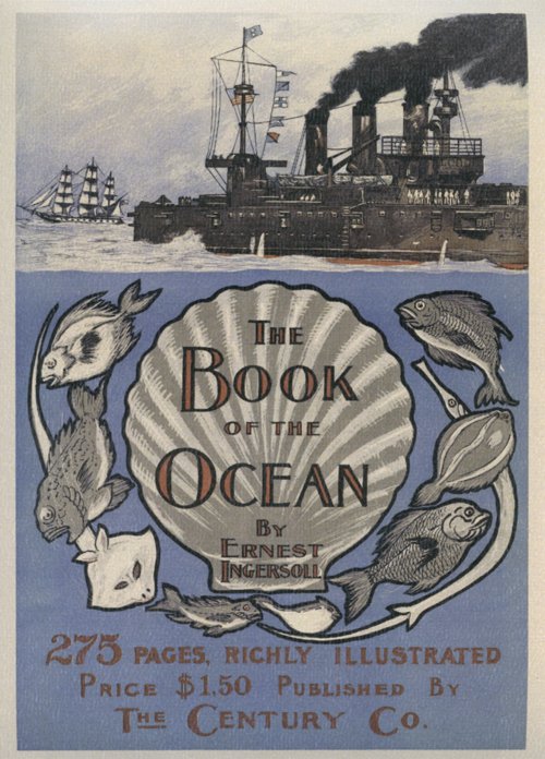 Yay, November brings me a book cover I really like! It’s the light periwinkle blue that is the main attraction. It’s also apt, as a periwinkle is a type of sea snail, as well as the more familiar flower. I also like the contrast between the stylised illustration and typography of the title section, and the more realistically drawn ships above.
For those of us in the southern hemisphere it’s also a lovely forecast of summer locales and shoreside festivities to come.
Happy November!
The Adventurers

Could any books seem more dissimilar? The book cover on this month’s calendar page makes me laugh, evoking as it does a story of adventurers, involved in desperate deeds. A quick read of its Wikipedia entry reveals that this book, published in 1906, is based on a true story set in Alaska about corrupt government officials seizing gold mines from prospectors. It has been made into five movies, the last being in 1955, which makes it ripe for yet another Hollywood remake.

September’s book cover, The Doctor, by Ralph Connor – which I endeavoured to ignore for the entire month – struck me as drearily designed in brown monotone. It was published in 1907, and according to reviewers on Good Reads, it is a worthy moral tale about a young countryman who overcomes poverty to realise his dreams of becoming a doctor and travelling the world.
I feel no hankering to track down and read either of them, but I certainly prefer to look at the more promising red cover.
Happy October!
Southern Charm
 I was happy to turn over another calendar page just for a change of scenery after the dismal cover of Frank Norris’ The Pit. This month features a delightful illustration of The House of Fulfilment, a book about which I can discover little except that it draws portraits of five American women of the North and South, each ‘types in themselves’.
The lines of this drawing a curvaceous and pleasing, perhaps alluding to the soft and cushiony shapes of the female figure. The blustery landscape and coquettish look of the young woman immediately brings to mind the heroine of another book: Scarlett O’Hara. I’m not inspired this month to hunt out this book, but I might revisit Gone with the Wind the film!
A Picture Tells a Thousand Words
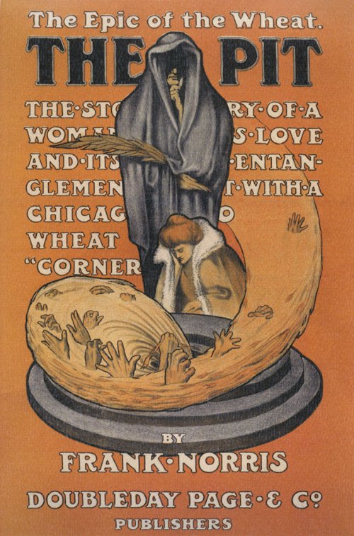 Look at the lurid cover of this dismal-sounding book on my July calendar page: ‘The Pit’, of all cheerful titles, complete with a Grim Reaper and a woman staring into the maelstrom of a sink plug full of drowning people. I was disgusted that I had to look at this all month!
Upon research however, I discover that the book is the second in an incomplete trilogy portraying the production, distribution and consumption of an American crop of wheat; the dryness of the subject is juiced up with human drama. The ‘pit’ of the title refers to the wheat speculation trading pits at the Chicago Board of Trade Building. One reviewer says the book is vividly and finely written, and the author apparently ‘broke with the traditions of his time and brought a fresh perspective to the American novel’. [Goodreads]
After reading Wikipedia’s summary of the plot, the analogous illustration of the cover certainly makes sense – and I am even intrigued enough to be interested in reading the book – but my initial reaction to the cover when I turned the calendar page was repulsion at its unsubtlety. What did readers at the turn of the last century thing, I wonder?