


Potato Palaver
I don’t often make Croatian style potato pancakes as it is a bit of a palaver, to be honest. Last week, however, I suddenly decided I would revisit my roots and make them. Subsequently, when I was brainstorming ideas to experiment with risoprinting effects, I thought it would be fun to create a step-by-step illustrated recipe to share – so here we are.

I don’t often make Croatian style potato pancakes as it is a bit of a palaver, to be honest. That comes from this modern style of cooking dinner where you arrive home from work, throw your hands up in the air in despair and throw whatever is in the fridge into a stir-fry, or salad bowl. Last week, however, I suddenly decided I would revisit my roots and make them.
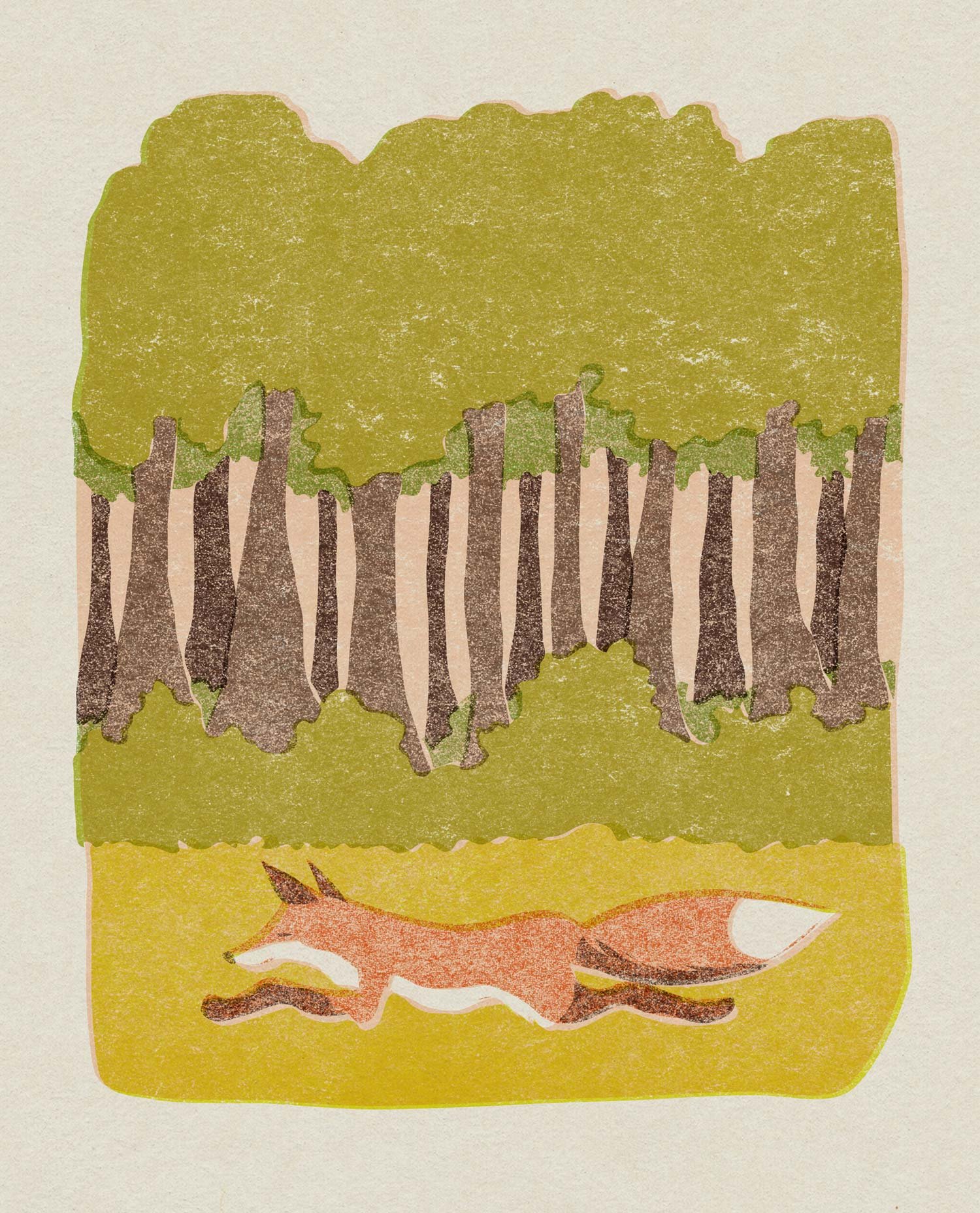
Subsequently, when I was brainstorming ideas to experiment with risoprinting effects, I thought it would be fun to create a step-by-step illustrated recipe to share – so here we are. As legibility was important, I kept the texture to a minimum under the text, and did not include any misaligned registratation effects.
When researching potato pancake recipes – according to Professor Google – I found no one else in the world seems to make them using this same method. My friend suggested it was a secret family recipe, but while that’s an exciting notion, it can’t be true, as questioned, my mum said both her own mother and my dad’s Ukrainian mother made them this way. Also, it utilises the same dough as potato dumplings, the recipe of which is commonly known.
One of my sisters says she usually only makes these when she has leftover mashed potato, and suggested that perhaps grandmas all over the countryside did so, but never passed the method on. It seems odd to me. Surely other people hailing from that part of the world have done the same? If you have or know of anyone who has, please let me know! Otherwise, feel free to try the recipe out yourself.
Riso x Retro
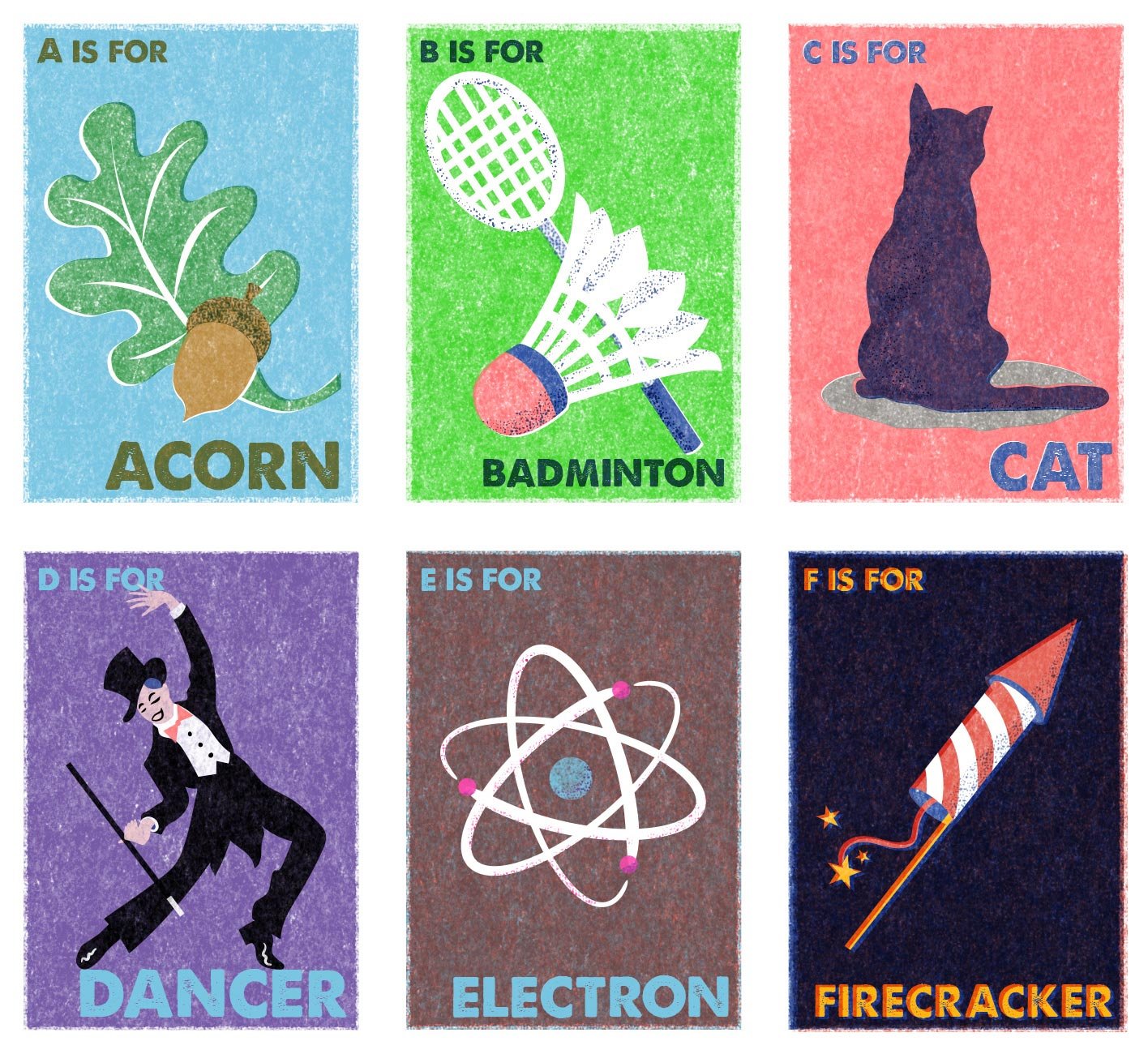
It’s no secret that I have a long-held love of vintage style, which runs the gamut of fashion to homewares to photography. I’ve long experimented with various vintage effects in my illustration work as well, one of the features being incorporating interesting textures. In particular, I’ve loved the texture created in lithography, traditionally using stone as the drawing surface. More recently I became interested in Riso printing – a more modern technique that looks very vintage.
Interested in experimenting with the look at reasonable cost, I purchased some Riso printing effects for Photoshop from RetroSupplyCo, and for the last few days I have been having great fun playing with them!

In the meantime, I had also discovered Eastern European vintage matchbox labels on Pinterest, and I absolutely adored their stylised graphics, minimal colour palette and crude printing.
I have combined these two inspirations and applied them to some existing unpublished illustrations I created years ago, and also created some new pieces directly inspired by the matchboxes. I’m already planning the next trio in the alphabet series, and keeping my fingers crossed that I’ll be able to do some commercial work in this style in the future.

2019 Photography Challenge
I take a lot of photos every day, as do many of us. I’m always keeping an eye out for inspiring, interesting or amusing sights … towards the end of 2018, I started thinking about a more purposeful and short-term photographic project.
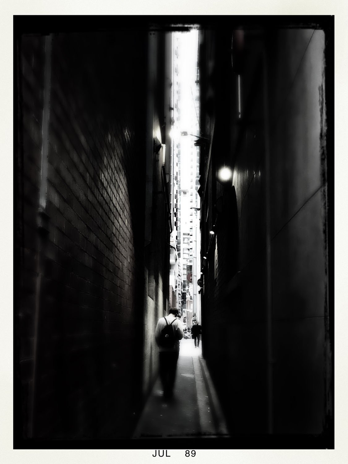
Urban Environment, July 2019
I take a lot of photos every day, as do many of us. I’m always keeping an eye out for inspiring, interesting or amusing sights. I already have an ongoing project, the Lost Collection which I first began 13.5 years ago: I looking for ‘lost things’ to photograph and add to my collection which! However, towards the end of 2018, I started thinking about a more purposeful and short-term photographic project.
I had been seeing a lot of monthly photo challenges floating around on social media, and I decided that could be a fun thing to do. However, none of the shared lists I had seen appealed to me wholly, so I wrote my own 30-day list that I intended to roll over each month. In addition, since I would be using my phone, I would use my favourite camera app, the Hipstamatic, and apply a different combination of lens, film and flash effects to each monthly set.
Some of the subjects I chose included obvious cues: self-portrait, nature, urban and domestic environments, clouds, sunsets/sunrises, animals etc, but I also included some prompts that would encourage lateral thinking, such as time, inspiration, nostalgia, literary. One of my prompts was the phrase, ‘Something old, something new, something borrowed, something blue’ – quite broad, but sadly I managed only one ‘borrowed’ item! In November I even added an extra degree of difficulty and used fashion as a general theme for the entire month, which was fun.
With 33,000 photos on my phone, I only recently managed the Herculean labour of downloading my camera roll in its entirety, and finally finished collating the last few months. You can read a bit more and view the entire portfolio here – each month is separated into its own gallery.

Upside-down, February 2019
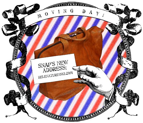
So Not A Princess is Moving!
Greetings dear readers, it’s been a very long time indeed since I last posted. What can I say – I just needed a break, even before the pandemic played havoc with all our lives. (You’d think with all the extra time on hand during Melbourne’s numerous lockdowns I would have being posting more, but no – I was not so inspired.) Considering I have not been posting for years however, I am pretty chuffed that people are still reading, and some of you are visiting direct – thank you so much, that’s very encouraging!
I have some news now though: So Not a Princess is moving (insert fanfare of trumpets):

As of 6 January 2023, my erstwhile domain name will be obsolete, but both the Style and Sketchbook blogs will survive intact at helenaturinski.com. Those of you with an eagle eye may have noticed that SNAP is already directing to the new domain name.
This website will briefly continue to look like this until the migration to Squarespace’s upgraded platform is completed, but when the transition is complete, you will still be able to click through to the blogs from the homepage.
There may even be – gasp! – some new content for your viewing pleasure. Until then …

Scarier than Darth Vader
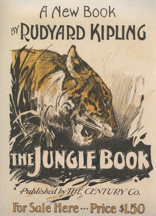 I have never read Kipling’s The Jungle Book. Like many though, I have seen the Disney animation. It was one of the first films I saw; reading a little about the synopsis makes me realise I retain absolutely no memories of it. What I do remember is being very cross because my sister made me go and see that instead of the original Star Wars with her and my cousins, citing that I was too young for violent science-fiction. (I was even crosser when I saw a boy about my age exit the cinema, having seen it and clearly suffering no ill effects.) But however childish I thought it was, I am sure I must have enjoyed The Jungle Book.
I am amused to compare some stills from the film with the cover art of this nineteenth century publication. That tiger looks scarier than Darth Vader. Compare its animated counterpart:

Cuddly, right?


I think I need to take a trip down memory lane and rewatch some of these childhood perennials.
This may be the last calendar picture I share for a while, as I recently found a vintage perpetual calendar in a thrift store, and plan to try using that next year. I rarely write on the actual wall calendar, using my phone diary as a planner, so it seems a little pointless to have one, apart from enjoying the pretty pictures every time I turn a month over. I expect I will often forget to move the paper cogs on the perpetual calendar however, but we shall see.
Happy December!