Riso x Retro
It’s no secret that I have a long-held love of vintage style, which runs the gamut of fashion to homewares to photography. I’ve long experimented with various vintage effects in my illustration work as well, one of the features being incorporating interesting textures. In particular, I’ve loved the texture created in lithography, traditionally using stone as the drawing surface. More recently I became interested in Riso printing – a more modern technique that looks very vintage.
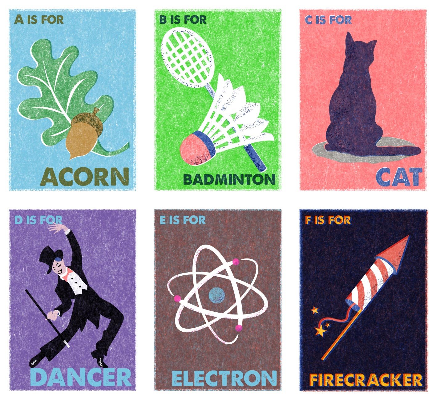
Interested in experimenting with the look at reasonable cost, I purchased some Riso printing effects for Photoshop from RetroSupplyCo, and for the last few days I have been having great fun playing with them!
In the meantime, I had also discovered Eastern European vintage matchbox labels on Pinterest, and I absolutely adored their stylised graphics, minimal colour palette and crude printing.
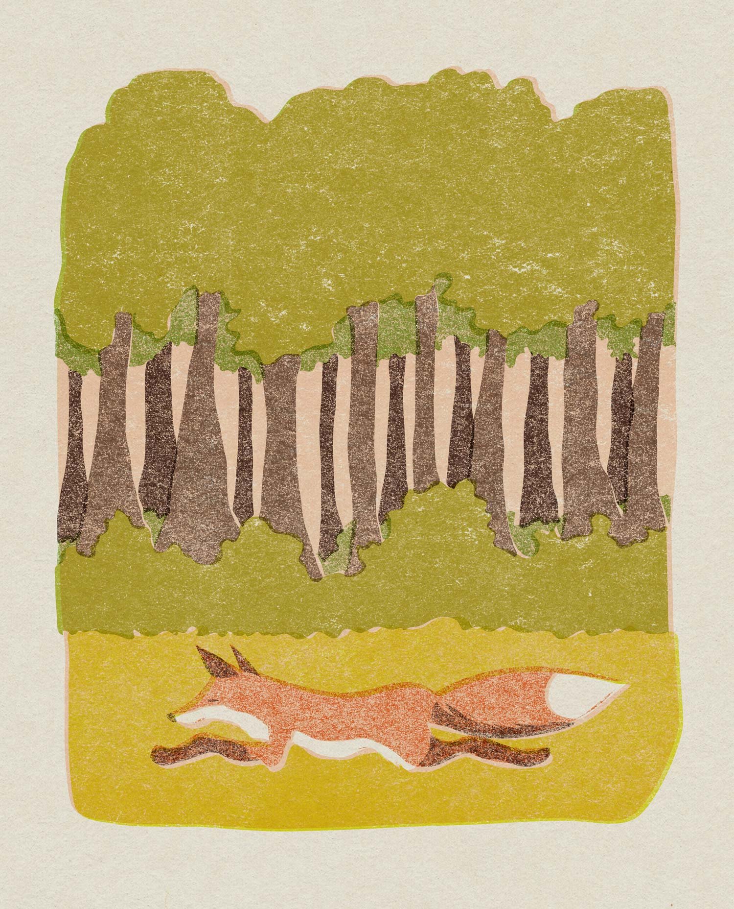
I have combined these two inspirations and applied them to some existing unpublished illustrations I created years ago, and also created some new pieces directly inspired by the matchboxes. I’m already planning the next trio in the alphabet series, and keeping my fingers crossed that I’ll be able to do some commercial work in this style in the future.


