Riso x Retro
It’s no secret that I have a long-held love of vintage style, which runs the gamut of fashion to homewares to photography. I’ve long experimented with various vintage effects in my illustration work as well, one of the features being incorporating interesting textures. In particular, I’ve loved the texture created in lithography, traditionally using stone as the drawing surface. More recently I became interested in Riso printing – a more modern technique that looks very vintage.
Interested in experimenting with the look at reasonable cost, I purchased some Riso printing effects for Photoshop from RetroSupplyCo, and for the last few days I have been having great fun playing with them!
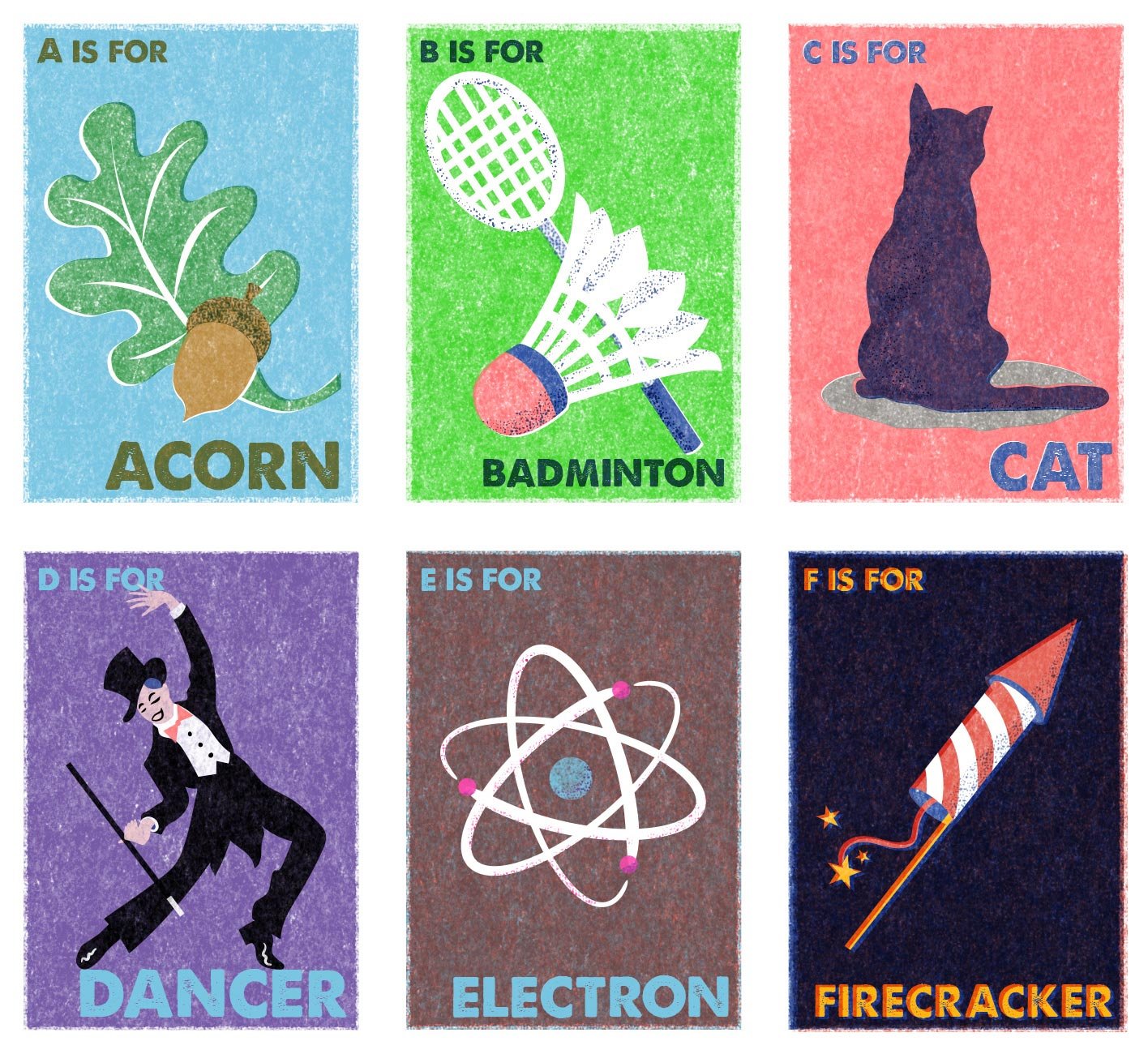
In the meantime, I had also discovered Eastern European vintage matchbox labels on Pinterest, and I absolutely adored their stylised graphics, minimal colour palette and crude printing.
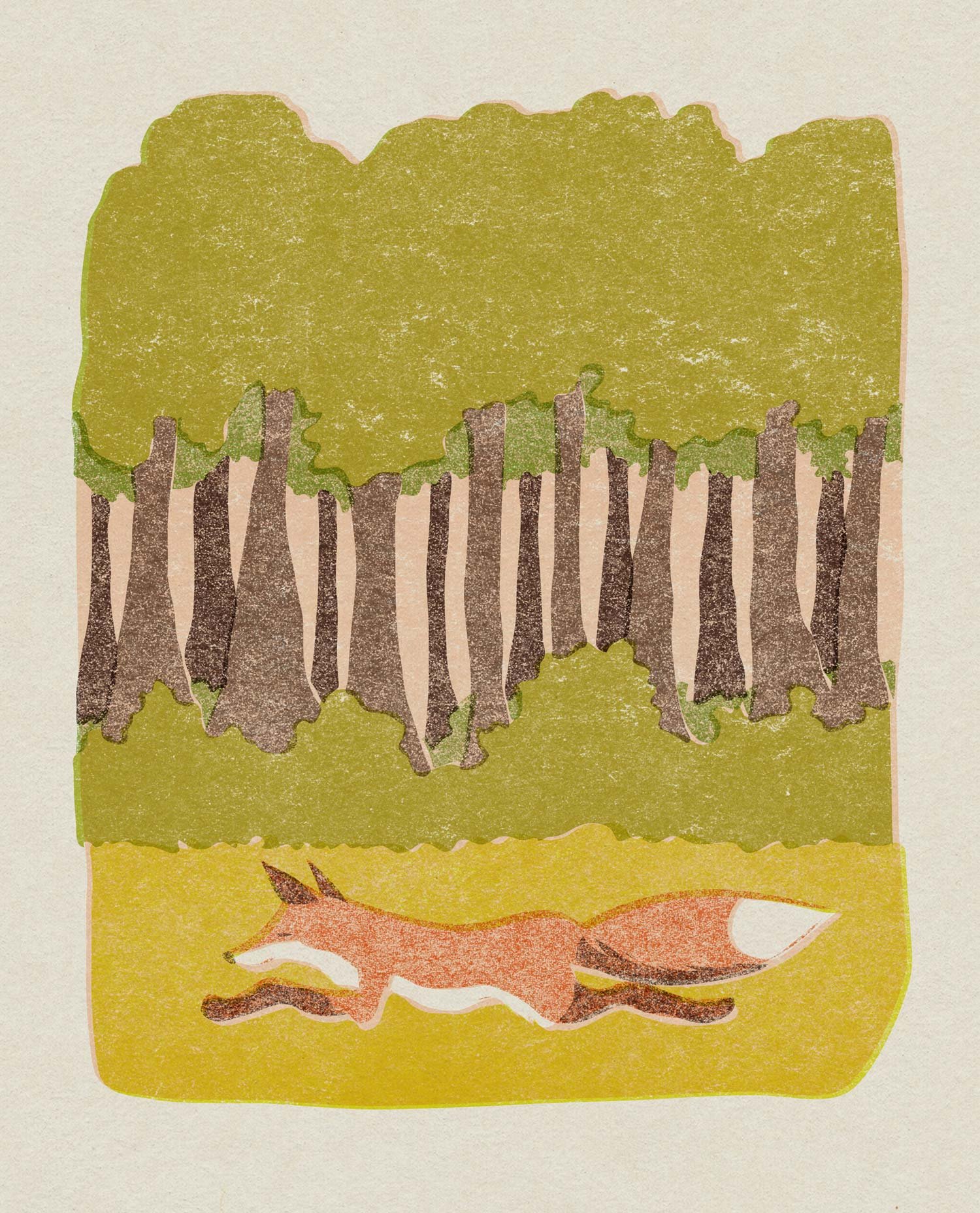
I have combined these two inspirations and applied them to some existing unpublished illustrations I created years ago, and also created some new pieces directly inspired by the matchboxes. I’m already planning the next trio in the alphabet series, and keeping my fingers crossed that I’ll be able to do some commercial work in this style in the future.
Scarier than Darth Vader
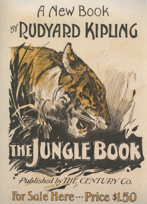 I have never read Kipling’s The Jungle Book. Like many though, I have seen the Disney animation. It was one of the first films I saw; reading a little about the synopsis makes me realise I retain absolutely no memories of it. What I do remember is being very cross because my sister made me go and see that instead of the original Star Wars with her and my cousins, citing that I was too young for violent science-fiction. (I was even crosser when I saw a boy about my age exit the cinema, having seen it and clearly suffering no ill effects.) But however childish I thought it was, I am sure I must have enjoyed The Jungle Book.
I am amused to compare some stills from the film with the cover art of this nineteenth century publication. That tiger looks scarier than Darth Vader. Compare its animated counterpart:

Cuddly, right?


I think I need to take a trip down memory lane and rewatch some of these childhood perennials.
This may be the last calendar picture I share for a while, as I recently found a vintage perpetual calendar in a thrift store, and plan to try using that next year. I rarely write on the actual wall calendar, using my phone diary as a planner, so it seems a little pointless to have one, apart from enjoying the pretty pictures every time I turn a month over. I expect I will often forget to move the paper cogs on the perpetual calendar however, but we shall see.
Happy December!
Sailing into November
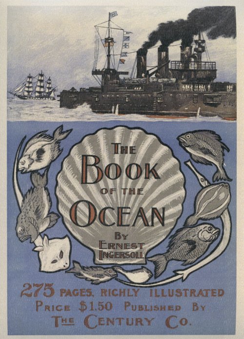 Yay, November brings me a book cover I really like! It’s the light periwinkle blue that is the main attraction. It’s also apt, as a periwinkle is a type of sea snail, as well as the more familiar flower. I also like the contrast between the stylised illustration and typography of the title section, and the more realistically drawn ships above.
For those of us in the southern hemisphere it’s also a lovely forecast of summer locales and shoreside festivities to come.
Happy November!
A New Spin
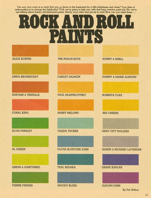 Whether you need a chuckle, or some colour inspiration, check out this chart of rock and roll paints, putting an amusing spin on musical theory crossed with the colour wheel.
The chart was shared to Flashbak, a Facebook group and is thought to have come from an early-to-mid-70s Scholastic magazine. There are some good ones there – I’m not sure which is my favourite pun!
Click the image for a larger version.
The Adventurers

Could any books seem more dissimilar? The book cover on this month’s calendar page makes me laugh, evoking as it does a story of adventurers, involved in desperate deeds. A quick read of its Wikipedia entry reveals that this book, published in 1906, is based on a true story set in Alaska about corrupt government officials seizing gold mines from prospectors. It has been made into five movies, the last being in 1955, which makes it ripe for yet another Hollywood remake.

September’s book cover, The Doctor, by Ralph Connor – which I endeavoured to ignore for the entire month – struck me as drearily designed in brown monotone. It was published in 1907, and according to reviewers on Good Reads, it is a worthy moral tale about a young countryman who overcomes poverty to realise his dreams of becoming a doctor and travelling the world.
I feel no hankering to track down and read either of them, but I certainly prefer to look at the more promising red cover.
Happy October!

