Delicious Apricot
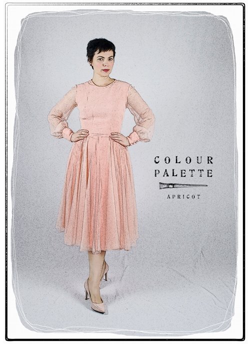 You will not be surprised to read that the colour apricot, like orange, takes its name from the fruit. The word first used in English to describe the fruit was abrecock, from Middle French, but it was not used to describe the colour until 1851.
Orange, on the other hand has been around for a little longer, first coming into use three centuries earlier. But before the descriptor ‘orange’, such shades were described by English speakers as giolureade – ‘yellow-red’*.
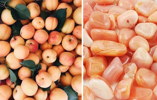 Apricots and agate
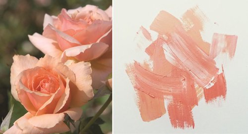 ‘Apricot Candy’ rose, and paint swatches
 Four different swatches for the colour apricot found in Google Images
Imagine then having to describe pale yellow-red! It’s no surprise that so many colours are simply named after an object – the only problem is that such things can vary in tone. Apricot is no exception – the fruit is variegated, and there are many variations of swatches available, but the shade is generally accepted to be much paler than the actual fruit. It is more yellow in tone than its sister shade, peach.
Apricot is a colour that I have never liked. In fact, the original concept of this story was ‘colours I hate’! For me, as I imagine for many others, it has always had connotations with bland, sickly 1980s interior décor (see below). Hideous – like a nightmare you couldn't wake from.
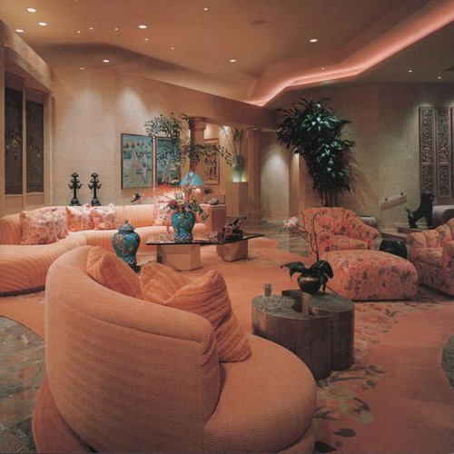 80s apricot interior design But a funny thing happened one day when I was browsing in a vintage bazaar with a friend. We conceived the humorous plan to each find the ugliest dress we possibly could, and try it on for a laugh. The chiffon apricot 70s dress is what I pulled out of the racks.
Unexpectedly however, once I had put it on, preened in front of the mirror and done a few twirls, it began to grow on me. Even my friend protested that I had chosen a dress that was not nearly as ugly as the one she had picked out (see below).
 My friend Sapphire and I try on some 80s dresses in a vintage bazaar in Geelong
The dress – the label declared it was by Elegance, which I have never seen before – was inexpensive, so whimsically I decided to buy it. I have even actually worn it out to an Opening Night at the theatre, with my pink Victorian cloak.
If you have light skin, there is a risk of looking naked wearing apricot and other such shades (who can forget Carrie and her ’naked dress’ in that episode of Sex and the City?), but there is no danger of that in this dress with its billowing sleeves and skirt. The dress has belt loops which are sadly bereft – I imagine it once had an extravagant sash.
 These sweet and pale tones were favoured in the 1920s to the 1940s for women’s lingerie – in such use, made from georgette, chiffon and satin and trimmed in pretty lace, were apricot and peach at the height of their powers. Delicious!
The colour has been seen in fashion since of course, especially in the 80s, when pastels, and brasher shades of coral and watermelon were the rage. It’s akin to Pantone’s 2019 Colour of the Year, Living Coral, and is already popular in interior design, so I wouldn’t be surprised to see a renaissance of full-blown apricot-hued revival soon. I bet you can’t wait!
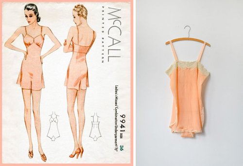 1930s lingerie
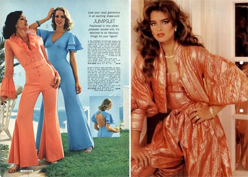 1970s jumpsuits, Brooke Shields in the 80s
*From The Secret Lives of Colour, by Kassia St Clair, John Murray 2016)
Images found on Pinterest
Photos: March 2017

