Archive
- Behind the Screens 9
- Bright Young Things 16
- Colour Palette 64
- Dress Ups 60
- Fashionisms 25
- Fashionistamatics 107
- Foreign Exchange 13
- From the Pages of… 81
- G.U.I.L.T. 10
- Little Trifles 126
- Lost and Found 89
- Odd Socks 130
- Out of the Album 39
- Red Carpet 3
- Silver Screen Style 33
- Sit Like a Lady! 29
- Spin, Flip, Click 34
- Vintage Rescue 20
- Vintage Style 157
- Wardrobe 101 148
- What I Actually Wore 163
A Celestial Hue
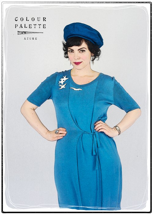 A modern dress with vintage 1950s hat and brooches from various erasThe colour azure is described as the colour of the sky on a clear day, but the origin of its name is in fact the blue mineral lapis lazuli. ‘Lapis’ is the Latin word for ‘stone’, and ‘lazuli’ is traced back through Medieval Latin, to the Arabic and ultimately to the Persian ‘lazaward’, which is the name of this stone in Persian, and also is the name of a place where the stone was mined.
 Tumbled nuggets of lapis lazuli
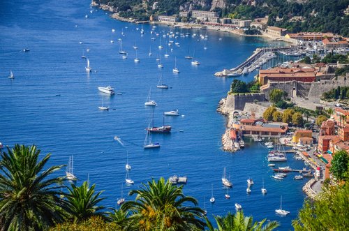 The Côte d'Azur
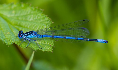 The azure damselflyDespite this generic meaning, the name of the stone became associated with the colour, assisted by its adoption in heraldry, where azure represented a blue colour in its system of tinctures. Many European languages subsequently adopted this root word, such as azur in French – whence comes the name of the Côte d’Azur – and the Italian azzurro, which also gives its name to the national football team.
The colour is also seen in the plumage of many birds, kingfishers, hummingbirds, jays, and also in damsel- and dragonflies.
It is also – quite literally! – a divine colour to wear.
 A vintage 1960s dress and hat
Photos: November, September 2018
Marvellous Mauve
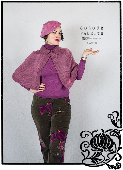 A couple of years ago I wrote a story about different shades of purple, and I touched on the discovery of the first aniline dye in 1856 that became known as mauve, the French word for mallow flower after which the colour is named. Originally it was probably a darker shade than contemporary notions of it, as it was first likened to Tyrian purple which is much darker. The first mauve dye was replaced with other synthetic dyes in 1873: a lighter, less-saturated shade that we are familiar with today. As Wikipedia succinctly describes it, ‘mauve contains more grey and more blue than a pale tint of magenta’.
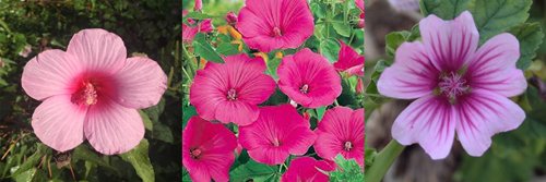 Three shades of mallow flowersHowever, while it was a synthetic dye, in the 1850s it was still quite expensive to process, and if not for Empress Eugénie, wife of Napoleon III, taking a liking to it because it supposedly exactly matched her ‘violet’ eyes, the colour might have disappeared. Queen Victoria subsequently gave it the thumbs-up, and for a time it was all the rage, reaching its heights of popularity in the 1890s.
… for a time it was all the rage, reaching its heights of popularity in the 1890s
As with many trends, however, it soon reached over-saturation in the market and eventually it became passé, synonymous with ladies of a certain age. Even in the twentieth century, it was associated with aging, as it was one of the shades white-haired ladies chose to rinse their hair with to remove unlikable yellowish tones. Today of course that trend has been turned on its head and grey hair tinted with pastel shades is all the rage with young people!
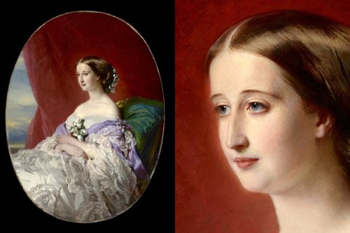 Empress Eugenie, 1854, by Franz Xaver Winterhalter – Franz clearly thought, "Pfft, purple eyes, MY EYE!"
Wait, what about the purple eyes?
I was interested in this notion of the Empress’s supposed violet eyes, and some research lead me to learn that Elizabeth Taylor was another celebrity famed for her violet eyes. Paintings are not necessarily true to life, and photographic evidence is obviously unreliable as it is too easy to digitally enhance hues or use colour filters in-camera.
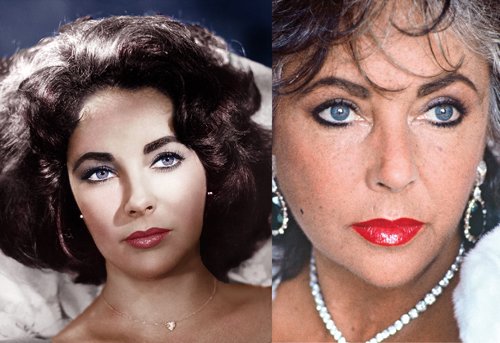 Elizabeth Taylor in 1960 (ph unknown) and 1985 (ph Helmut Newton); she definitely seems to have naturally blue eyes that have been enhanced by the colour processing in the first photoAfter a lot of reading, I can state definitely that the human eye does not naturally come in shades of purple; ie people cannot be born with it. Put simply, the colour of an iris changes depending on how much light reaches it, and can be enhanced by coloured clothing or makeup surrounding the eyes; both Empress Eugénie and Elizabeth Taylor had blue eyes: one wore purple garments, the other purple eyeshadow. [See Further Reading below]

Back to fashion …
Since my original story, I have since found new mauve items in differing shades all from thrift stores: a merino wool jumper, a prettily hand-knitted vintage wool cape, and a vintage angora, pearl-beaded beret. The jumper is modern, but I am not sure of the age of the latter two; the beret was missing pearls when I bought it, but the cape is pristine and could be a modern knit made using a vintage pattern. My printed velvet pants are modern, by the Australian label Charlie Brown.
Scroll down and check out some more mauve outfits from the Victorian era to the present.
Further Reading
The biology behind eye colour in humans
Were Elizabeth Taylor’s eyes really violet?
But wait, Liz Taylor had double eyelashes!
Just how did Lizzie make her blue eyes look purple?
Photos: August 2019
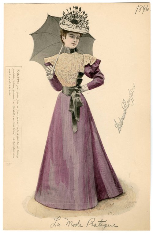 Victorian walking dress, 1896
 Victorian evening dress, 1896
 Victorian silk striped walking dress
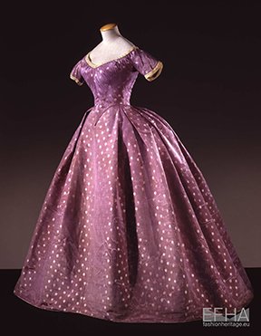 Silk taffeta evening dress, 1860-1865
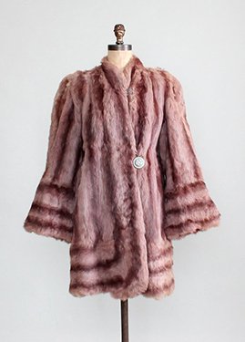 1930s fur jacket (sold)
 1930s bias gown (for sale)
 1940s catalogue – how I would love to buy this set, especially at those prices!
 Model Evelyn Tripp, wearing a dress and matching hat, ph Frances McLaughlin-Gill for Vogue
 Modern outfit
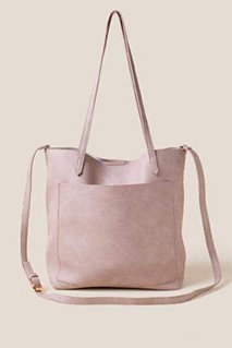 Rosie tote in mauve
When Wearing Stripes Becomes Optical Art
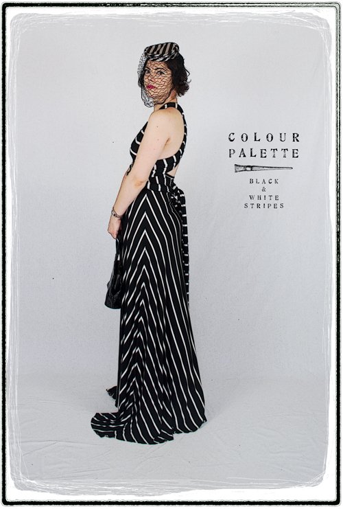 If any of my readers want proof of my devotion to stripes, behold this dramatic dress of striped jersey!
The dress, by Olivaceous (a brand I’ve never heard of) has a halter neckline formed by two extremely long ties that lift to create the bodice, cross my back, wind around waist a once or twice and then tie in a huge bow at the base of my back – and the ends still dangle to my knees! In addition, the maxi skirt is so wide and long that I have to carry it like ladies of yore so that I don’t trip and fall on my face. I like to think it evokes 1930s style a little.
Maximum drama makes it the perfect dress to wear to an Opening Night at the theatre last January, and making doubly-sure I turn heads, I pair with it a 1940s black and white satin veiled pillbox hat. The fabric is made of viscose, so it has flows beautifully; almost mesmerisingly. I feel like a piece of Op Art wearing it!
Photo: April 2019
Delicious Apricot
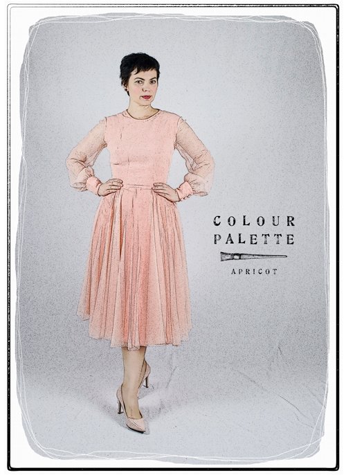 You will not be surprised to read that the colour apricot, like orange, takes its name from the fruit. The word first used in English to describe the fruit was abrecock, from Middle French, but it was not used to describe the colour until 1851.
Orange, on the other hand has been around for a little longer, first coming into use three centuries earlier. But before the descriptor ‘orange’, such shades were described by English speakers as giolureade – ‘yellow-red’*.
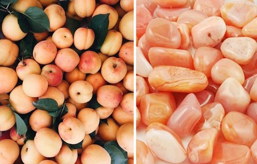 Apricots and agate
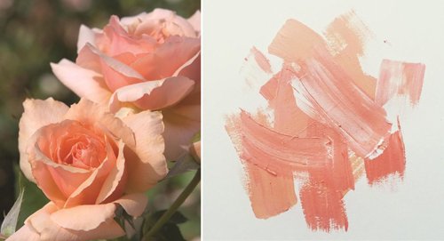 ‘Apricot Candy’ rose, and paint swatches
 Four different swatches for the colour apricot found in Google Images
Imagine then having to describe pale yellow-red! It’s no surprise that so many colours are simply named after an object – the only problem is that such things can vary in tone. Apricot is no exception – the fruit is variegated, and there are many variations of swatches available, but the shade is generally accepted to be much paler than the actual fruit. It is more yellow in tone than its sister shade, peach.
Apricot is a colour that I have never liked. In fact, the original concept of this story was ‘colours I hate’! For me, as I imagine for many others, it has always had connotations with bland, sickly 1980s interior décor (see below). Hideous – like a nightmare you couldn't wake from.
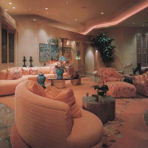 80s apricot interior design But a funny thing happened one day when I was browsing in a vintage bazaar with a friend. We conceived the humorous plan to each find the ugliest dress we possibly could, and try it on for a laugh. The chiffon apricot 70s dress is what I pulled out of the racks.
Unexpectedly however, once I had put it on, preened in front of the mirror and done a few twirls, it began to grow on me. Even my friend protested that I had chosen a dress that was not nearly as ugly as the one she had picked out (see below).
 My friend Sapphire and I try on some 80s dresses in a vintage bazaar in Geelong
The dress – the label declared it was by Elegance, which I have never seen before – was inexpensive, so whimsically I decided to buy it. I have even actually worn it out to an Opening Night at the theatre, with my pink Victorian cloak.
If you have light skin, there is a risk of looking naked wearing apricot and other such shades (who can forget Carrie and her ’naked dress’ in that episode of Sex and the City?), but there is no danger of that in this dress with its billowing sleeves and skirt. The dress has belt loops which are sadly bereft – I imagine it once had an extravagant sash.
 These sweet and pale tones were favoured in the 1920s to the 1940s for women’s lingerie – in such use, made from georgette, chiffon and satin and trimmed in pretty lace, were apricot and peach at the height of their powers. Delicious!
The colour has been seen in fashion since of course, especially in the 80s, when pastels, and brasher shades of coral and watermelon were the rage. It’s akin to Pantone’s 2019 Colour of the Year, Living Coral, and is already popular in interior design, so I wouldn’t be surprised to see a renaissance of full-blown apricot-hued revival soon. I bet you can’t wait!
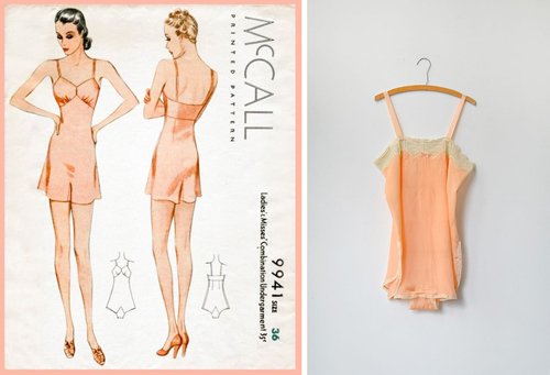 1930s lingerie
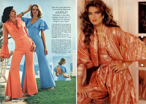 1970s jumpsuits, Brooke Shields in the 80s
*From The Secret Lives of Colour, by Kassia St Clair, John Murray 2016)
Images found on Pinterest
Photos: March 2017
Another Lemon Slice
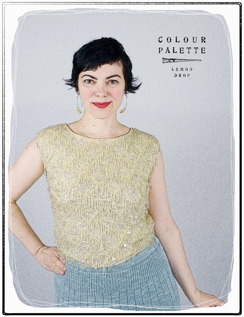
So here is the 1960s sequin shell top I bought on the Day of the Yellow Bonanza. It looks very subtle in this picture, and it is quite a pale lemon yellow, a nice addition to my ever-growing collection of sequinned garments. (Rather hilariously, I am suddenly reminded that many years ago I painted my bedroom and boudoir this exact colour combination. Lemon yellow above the picture rail, and robin’s egg blue below – how funny!)
What I like about this particular 1960s sequinned rendition is that when the top is off, it looks like an ordinary shell, but on the body it has cap sleeves. Admittedly it is a little boxier in shape than I would prefer – scroll down and compare it to the red top – but for sequins and yellow ones at that, I will not complain!
Photo: August 2018

