A New Spin
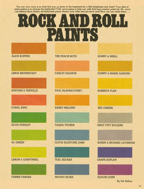
 Whether you need a chuckle, or some colour inspiration, check out this chart of rock and roll paints, putting an amusing spin on musical theory crossed with the colour wheel.
The chart was shared to Flashbak, a Facebook group and is thought to have come from an early-to-mid-70s Scholastic magazine. There are some good ones there – I’m not sure which is my favourite pun!
Click the image for a larger version.
Proof Positive You Can’t Judge a Book by its Cover
 I am most intrigued by this book cover on my April calendar page. ‘Where Ghosts Walk.’ What does it mean, I wonder? Is it a blood-curdling nineteenth century gothic novel set in a monastery, or crumbling medieval mansion? Or is it perhaps a haunting moral tale of love lost and a quest for redemption?
Then I remembered the global librarian, Professor Google, and made enquiries. I was disappointed to discover that the subject of this book published in 1898 is nothing so lurid (or fun). Amazon describes it as ‘The Haunts of Familiar Characters in History and Literature’; one person on Good Reads has rated it two stars, but left no review to explain this scathing dismissal.
Is it a blood-curdling nineteenth century gothic novel set in a monastery, or crumbling medieval mansion?
A subsequent and brief perusal of the first chapter on the Internet Archive did not incline me to read further: it is tedious and the literary style both old-fashioned and laboured. The chapter titles are deceptively enticing however: ‘Her Gloomy Honeymoon’, ‘Dante’s Everyday Wife’ and ‘Told on the Lagoon’ for example. The text does not live up to them. (Feel free to confirm this yourself, but don’t blame me for the minutes of your life lost.)
I wonder if this is why the publishers chose this book cover for the month that begins with a day of trickery? I would have preferred a gothic novel, BUT we can all enjoy the attractive design of the cover – and it proves that old adage of not judging a book by its cover!
Happy April, by the way!
Killer Diller
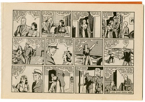
 When I was a young teen I went through a short period of enjoying reading the adventures of The Phantom. Those comics were probably my last foray into graphic novels, but apart from the adventuring itself, the vintage forties illustrations were particularly appealing.
 Click on the images for larger versionsOn the weekend I picked up a reproduction comic of The Phantom Versus “the Spy Ring” in an op shop for $1, and had fun reading it late yesterday evening. While this story came to a satisfactory conclusion, I had forgotten that these were serial! Damn. Now I’ll always wonder if the Phantom ever ran the spy chief Baron to ground.
I was glad however that his fiancé Diana featured prominently in this story, for I enjoyed her 1940s fashions, especially this beach pyjamas ensemble complete with headscarf and high heels that she wore on the dastardly Baron Danton’s yacht.
I have always hankered for a pair of beach pyjamas, but feel stymied not only by their rarity and expense, but the lamentable fact that any vintage jumpsuit I have tried on has proven to be too short in the body for me. You can see it a bit better in this detailed scan below.
In 40s parlance, aren’t they just killer diller*?
* That would be amazing.
A Delightful Little Diva
 Oh, this illustration makes me chuckle – it’s delightful and funny. I once new a white cat just like this one, called Diva, and that naughty child is certainly being a bit of a diva!
This is the picture on the August page of my calendar, and it is a pleasant one to look at. The linework is masterful, as well as the trick of filling the negative spaces with a lovely palette of colour and pattern, and allowing the white of the page to fill the positive. It’s a very effective technique. Unfortunately, the calendar does not include illustration credits, but this looks 1920s or 30s to me.
Happy August, dear readers!
I See Unicorns!

A little while ago I was doing some picture research on vintage advertising on Pinterest, and I came across this priceless piece of advertising for ‘Magical Musk’ (the fragrance of hidden flowers), brought to you courtesy of Max Factor. Because how else would you advertise a floral musk cologne except with a rearing unicorn wreathed in mist? The perfume bottle itself reminds me of a soft-serve ice cream cone! … A unicone, as it were.


