Sailing into November
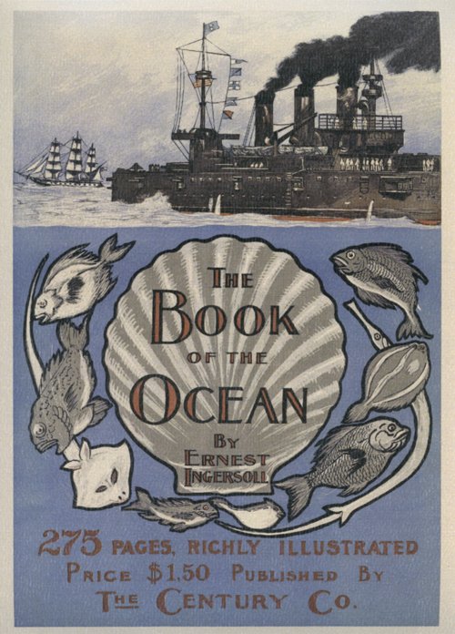 Yay, November brings me a book cover I really like! It’s the light periwinkle blue that is the main attraction. It’s also apt, as a periwinkle is a type of sea snail, as well as the more familiar flower. I also like the contrast between the stylised illustration and typography of the title section, and the more realistically drawn ships above.
For those of us in the southern hemisphere it’s also a lovely forecast of summer locales and shoreside festivities to come.
Happy November!
Reflecting the Female
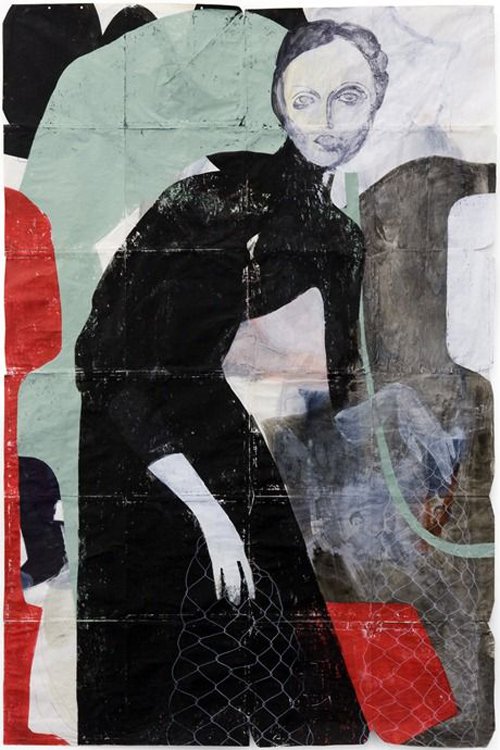
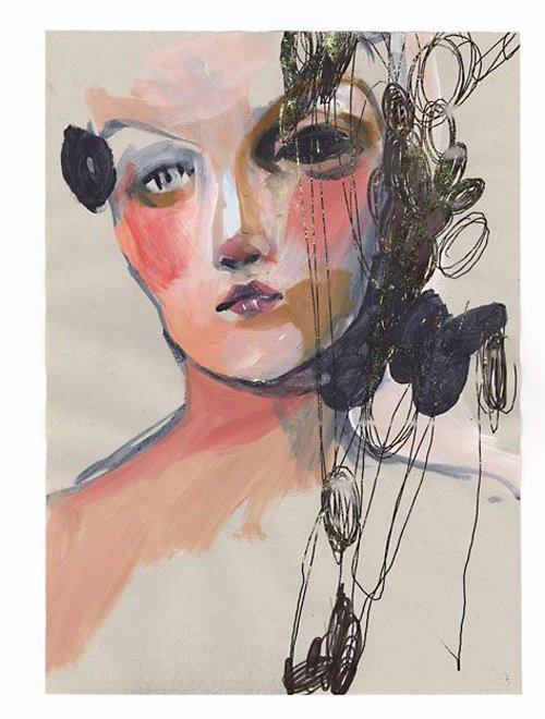
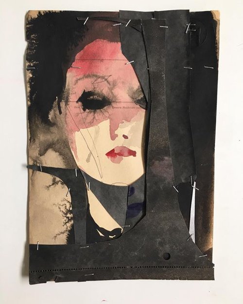
 I only recently discovered the art of Tina Berning, thanks to that magical font of information: Pinterest. I love her technique – the use of mixed media, collage and ephemera as a base, the unfinished look of them – more than the subject, although ‘reflecting the female role in media is one of the core issues in her artistic work. Her early passion for editorial illustrataion led her to an intensive contemplation on the human figure.’ [Wikipedia]
 Berning has been focused on drawing and illustration since 2000; she has been published widely, and has had numerous solo exhibitions. Her website doesn’t seem to hold much information on her, but there is plenty more gorgeous and inspiring work to browse through.

Drawn to Lines
 Femme se reposant, 1937
Henri Matisse (1869-1954) is one of my favourite artists. One of the Fauves, he was famous for his use of colour, and was known mainly for his paintings, but I in fact love his drawings, sketches and paper cutouts even more. The quote below from an article in The Boston Globe about an exhibition of Matisse’s drawings describes their elegant purity so perfectly:
The drawings of Henri Matisse must surely be among the most beautiful objects made by any human hand in the 20th century — or, come to think of it, ever. You look at them, you register their legendary ease and simplicity, and it’s very easy indeed to take them for granted — to assume that in some strange way they were born and not made.
Matisse’s characteristic line, at once classically concise and dreamily unmoored, has in that sense become a cliché, part of the visual air that we breathe. [Sebastian Smee, from The Boston Globe]
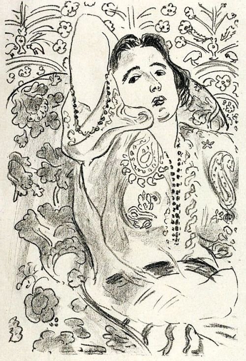 Arabesque, 1924
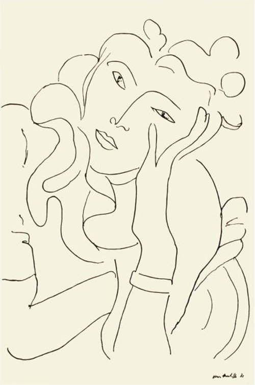 La Fleur, 1937
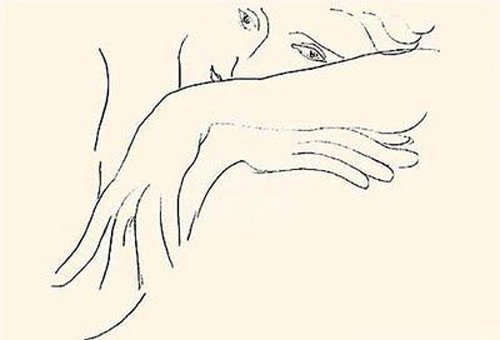 The Handkerchief, 1935
 The Romanian Blouse, 1942I have been using Pinterest actively only for a year or two, and began mainly for the purposes of research. The more I used it of course, the more personalised my home page became: amongst a sea of vintage hats and fashion, out pop the works of Matisse, and in particular his line drawings, sketches and cutouts. With time, it’s been interesting to see the algorithms at work, refining my homepage according to my personal aesthetic. Obviously, the more Matisse drawings I saved – the ones I was naturally drawn to – the more I was shown. Then my love of Matisse drew in other artists who also employ linework in their art (more on them another time).
I don’t know how many artworks Matisse made – they seem innumerable, and he kept on working almost until his death at 84, but here are a few of his monochrome drawings that I like.
(All images found on Pinterest. I have tried to discover the correct titles and dates for each work, but searching in the Google is like looking for a needle in a haystack sometimes, and there are a few which don't include full information.)
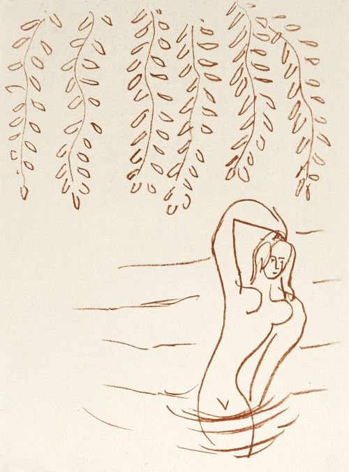 Hanging branches, 1948
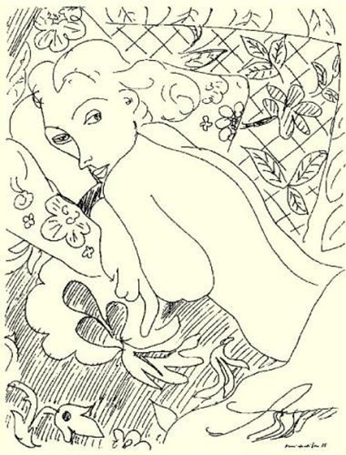
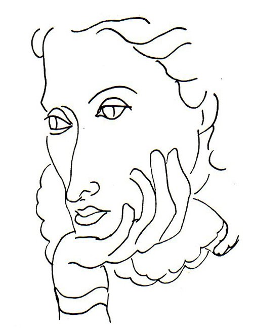
 1942
1942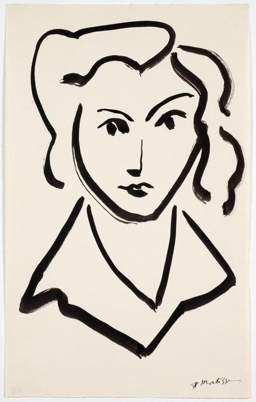 Tete de femme (Head of a Woman)
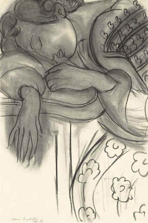 Étude pour La Dormeuse, 1939
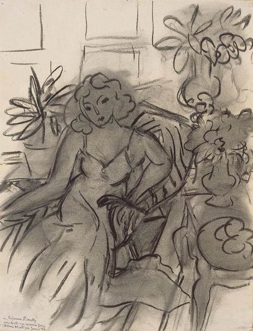 Femme au fauteuil, 1941
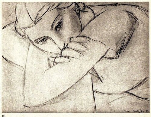 Lithograph, 1935
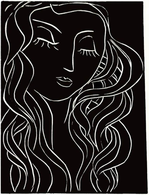 Linocut; Sleeper with the long eyelashes, 1944
Warhol’s Captivating Sense of Fun
 Looking at Cecil Beaton’s illustrations immediately put me in mind of Andy Warhol’s own illustrations, which I have always preferred to his fine art output. In the 1950s and before he became his own brand, Warhol worked in the advertising industry as a very successful artist. He even won several Art Directors Club awards.
Warhol moved to New York in 1949 after studying commercial art at the Carnegie Institute of Technology in Pittsburgh. And for the next ten years he worked on Madison Avenue, illustrating fashion, in particular shoe advertisements for I. Miller and other advertising clients; LP covers; and several books, such as 25 Cats Named Sam and One Blue Pussy, Love Is A Pink Cake, and Wild Raspberries.


 He returned to drawing in the 1970s, continuing to his death in 1987, but probably his most famous are the shoe drawings, which were published on Sundays in the New York Times, with captions written by his mother. (I must say I much prefer Warhol’s shoe illustrations to the work of another famous shoe illustrator, that of Manolo Blahnik.)


 There is a lovely, light unselfconsciousness in Warhol’s drawings; in the imprecise linework that charms; in the whimsical creatures that inhabit the drawings – unicorns, yapping lapdogs and well-to-do pussycats wearing pearls. The sense of fun is captivating.
Images found on Pinterest.


Spring is Here (Sort of)!
 We Melburnians been kept on our toes by spring’s wayward weather almost for a couple of weeks now, but what a great feeling it was on the first day of the month to know winter was over, and to turn over the page of my Frankie calendar to see this image from German illustrator Anke Weckmann.
Weckmann’s whimsical style and light touch is a perfect choice for September. The subject and colours are fresh and certainly springlike, and there is that lovely liberating feeling evoked by the new season.
One does indeed wish to lounge under leafy trees when the sun shines – fitfully enough in Melbourne at this time of year. It can literally switch from glorious sunshine and blue skies to wind-whipped clouds and lashing rain in minutes! We might all grumble and complain, but secretly we love our temperamental climate and boast of its capriciousness to visitors.
Hope you are enjoying a happy September.

