Woman in Red Tights
Today I thought I’d work on an illustration with some fashion content …
Today I thought I’d work on an illustration with some fashion content. One of the ideas I’d noted was a woman sitting cross-legged on the floor wearing tights; I’d seen an ad on social media for a brand of hosiery, and thought it would make a fun subject for illustration.
The original sketch
I deliberately chose not to do this in a painterly style. I wanted something quite graphic and flat, with an interesting interaction of negative space, and an off-key colour palette. I resisted the impulse to add more tone, and I am quite pleased with the result.
Warhol’s Captivating Sense of Fun
 Looking at Cecil Beaton’s illustrations immediately put me in mind of Andy Warhol’s own illustrations, which I have always preferred to his fine art output. In the 1950s and before he became his own brand, Warhol worked in the advertising industry as a very successful artist. He even won several Art Directors Club awards.
Warhol moved to New York in 1949 after studying commercial art at the Carnegie Institute of Technology in Pittsburgh. And for the next ten years he worked on Madison Avenue, illustrating fashion, in particular shoe advertisements for I. Miller and other advertising clients; LP covers; and several books, such as 25 Cats Named Sam and One Blue Pussy, Love Is A Pink Cake, and Wild Raspberries.


 He returned to drawing in the 1970s, continuing to his death in 1987, but probably his most famous are the shoe drawings, which were published on Sundays in the New York Times, with captions written by his mother. (I must say I much prefer Warhol’s shoe illustrations to the work of another famous shoe illustrator, that of Manolo Blahnik.)


 There is a lovely, light unselfconsciousness in Warhol’s drawings; in the imprecise linework that charms; in the whimsical creatures that inhabit the drawings – unicorns, yapping lapdogs and well-to-do pussycats wearing pearls. The sense of fun is captivating.
Images found on Pinterest.


The Exuberance of Cecil Beaton
 First edition of The Blessing, by Nancy Mitford with cover art by Cecil BeatonRecently I started reading Nancy Mitford’s book The Blessing, which, a few chapters in, is proving very entertaining. I first spotted this first edition book on a shelf in an op shop (thrift store), my eye caught by the author’s name as well as the colourful though tattered spine.
I had heard of Nancy Mitford (1904–1973), but I didn’t know much about her life. One of the famous Mitford sisters, she was a novelist, biographer and journalist. The book The Blessing, is considered one of her best, and was dedicated to her very good friend Evelyn Waugh. He told Mitford he found the book, “admirable, deliciously funny, consistent and complete, by far the best of your writings”.
My eye was caught by the illustration; the cover artwork of this first printing in 1951 is by Cecil Beaton and through the rearing horse, and tilting angles evokes a madcap adventure with the heroine’s young child (the ‘blessing’ of the title) at its centre.
 Portrait of Coco Chanel
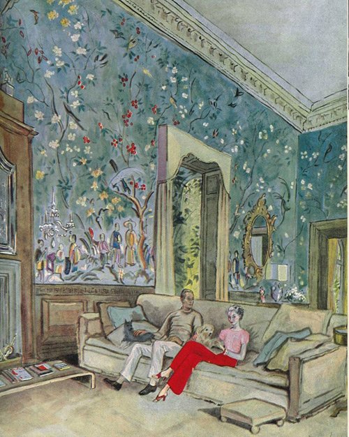 Cecil Beaton (1904–1980) was a prolifically creative person: ‘a fashion, portrait and war photographer, diarist, painter, interior designer and an Oscar-winning stage and costume designer for films and the theatre’. [Wikipedia] I have always admired Beaton’s dedication to detail in his drawings in particular: what patience he had in faithfully depicting the intricacies of interior décor in his portraits of the wealthy! The wallpaper patterns especially impress me, and it is no wonder after all, for he was also a textile designer, and his fabric designs were used by Balenciaga, Dior and Lanvin. (Read more here.)
Here is a small collection of Beaton’s exuberant illustrations that show a joyful sense of colour and playful riot of pattern and texture.
Images from Pinterest
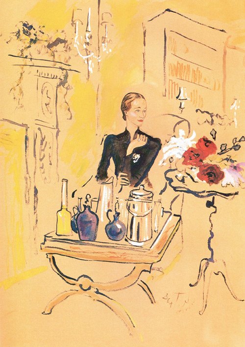 Portrait of the Duchess of Windsor
 Beaton's accessories for Vogue magazine
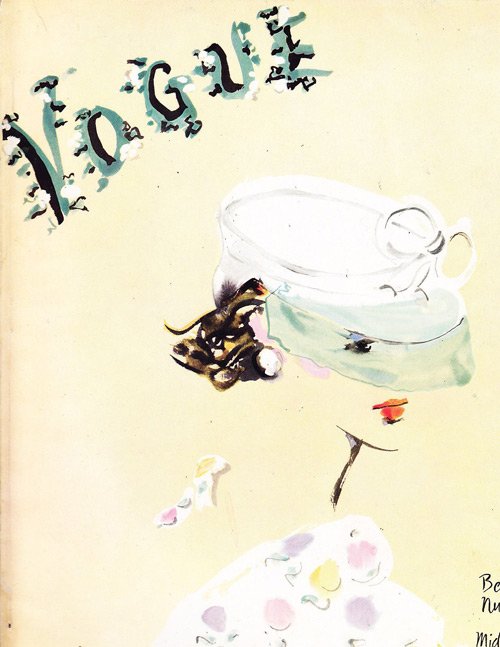 Vogue cover, June 1935
 Vogue cover, July 1935
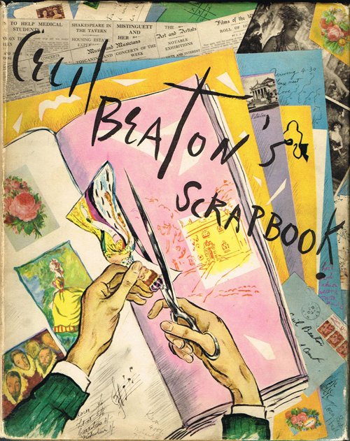 Front cover of one of his personal scrapbooks, full of society photographs
 Back cover of Cecil Beaton's scrapbook
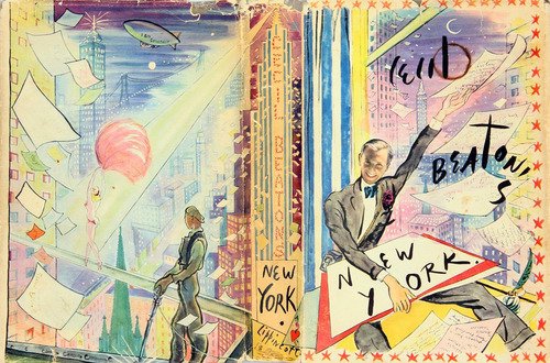 Wraparound book cover (click image for larger version)
Weigel’s 1501
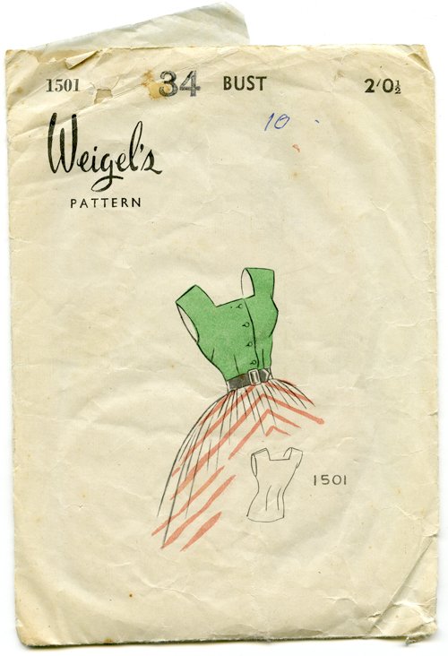 Knowing how I love paper ephemera, a friend of mine bought me this quaint 1950s sewing pattern from an op shop (thrift store) a little while ago. I had never heard of Weigel’s Patterns, but their office and factory address – as printed on the reverse – would have been situated twenty-minute’s walk from my home.
Everything about this design is fantastic: the simplicity of the front; the mish-mash of fonts, the strange alignments of the typesetting, varying types of rules, and halftone illustration. Perhaps it is simply the fact it is a relic from a bygone era that makes it so appealing, because no one typesets like this anymore. Have you seen a modern-day pattern envelope? Practicality and clear reference photographs notwithstanding, they are very ugly!
 Don’t you just love that the zip is called a ‘slide fastener’? The word ‘zipper’ or ‘zip’ as it is commonly used in Australia, was actually coined in 1923, by the B. F. Goodrich Company of America. They used the slide fastener on a new type of rubber boot, and referred to it as a ‘zipper’ – and thereafter the name stuck. The word itself is onomatopoeic, meaning it was named for the sound the fastener makes when it is used – a high-pitched zip! [Wikipedia]
This pattern is actually my size, so I think it would have been rather fun to have a blouse made for me – if only all the pieces were there. As it is, I may use the blank tissue inside in my mixed media artwork one day.
Spring Spring But Different
 Pantone's Top 12 Colours for Spring 2018
So, Pantone has assessed the fashion runways at New York Fashion Week and has produced this selection of twelve colours (plus four more basic neutrals of navy, grey, beige and white) that will influence the fashion industry over Spring/Summer 2018.
Apparently consumers are still embracing colour: ‘The desire for colorful self-expression is a key take away for Spring 2018. The color story is wildly divergent and we see a kaleidoscopic bounty of uplifting shades and feel-good tones. There is a feeling of optimism and confidence driving a new vitality into fashion trends.’ [Pantone]
This is a collection of more unusual tones – more muted or slightly ‘off-key’ – than we usually see in spring hues. I grew up in the Eighties, and they seem very reminiscent to me of that era.
It’s a little confusing to me in Melbourne though, as we have just entered spring. What were Pantone’s spring colours for this year? They turn out to be pretty much the same, but slightly different: a little fresher and clearer. I suspect no one but the most stern fashionista will notice the difference if one were to mix them!
PS. Note how very similar the colour palette in the September calendar illustration below!

