The Turn of the Seasons
 It’s time to turn the calendar over once more, and I must first apologise for my rare appearances on SNAP these days – other things have been keeping me busy. But more importantly, happy spring! Or, happy autumn if you are in the northern hemisphere. This Vogue cover from August 1927 is certainly more appropriate for you northerners at any rate.
The painting is by Georges Lepape (1887–1971), one of my favourite illustrators of the Art Deco period. He was influenced by orientalism – as evidenced by his flat, two-dimensional style – and the Ballets Russes. Lepape illustrated for magazines such as Gazette du Bon Ton, Vanity Fair, Harper’s Bazaar and Vogue as well as illustrating advertisements for his own clients – Paul Poiret, Jean Patou, Hermès – during his long career.
Have a lovely and fruitful September.
A Punch in the Eye
 There is jewellery out there that is subjectively unappealing … and then there is jewellery that is unquestionably and irrefutably downright ugly. In the case of the former, there might be someone out there who might like it, in the case of the latter: if you like it, there’s something wrong with you. As one of my friends and I like to say: there’s good bad design, and just plain bad.
An item designed with sound principles in mind* – composition, balance, scale, colour, medium – and executed well may nevertheless be unappealing to some. Beauty is in the eye of the beholder after all. Sometimes it’s a punch in the eye. But when a product is crafted without consideration of these fundamental criteria, then all bets are off. In face of a fan we can presume the ugly product in question is a mirror of their bad taste.
Beauty is in the eye of the beholder after all. Sometimes it’s a punch in the eye.
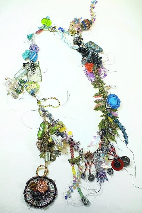
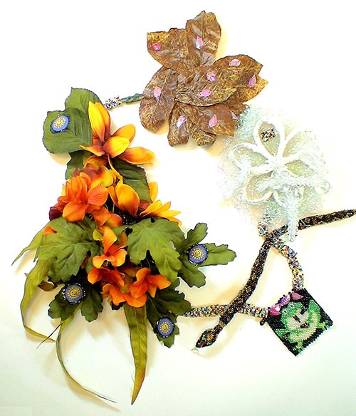
A newsletter from a jewellery supplies website Land of Odds appeared in my inbox this morning, and when I clicked on it I saw an image of an extremely ugly necklace. “Gosh that’s ugly,” I thought, and then saw that it was in fact advertising the annual Ugly Necklace competition that the website runs. This is an interesting challenge; as the competition promoters state: ‘It ain’t easy doing ugly, or as my momma says, “Ugly is as Ugly does.”’.
A talented and skilled artisan is not naturally given to creating something ugly. However, there are some who have managed to overcome this natural diffidence.
Although these first three examples of ugly necklaces are undeniably frightful, there is some coherence to their design: the materials used bear some relationship to one another. The last necklace owes its overall ugliness to the juxtaposition of its diverse materials. These separate components broken apart would be repellent enough, but combined into one disparate and ghastly whole, this necklace enters into another realm of ugliness entirely.
Scroll down and you be the judge.
* Click here to read about fundamentals of good jewellery design
All images from Land of Odds Ugly Necklace competition


