Your reminder to remember
Recently I was sitting relaxing in the armchair before the fire with my beloved ginger cat on my lap and thought to myself, I must remember this, exactly how she feels …
Recently I was sitting relaxing in the armchair before the fire with my beloved ginger cat on my lap and thought to myself, I must remember this, exactly how she feels; the full weight of her as she lies utterly supine and trusting on her favourite couch, letting go of every care.
How lucky are those of us who are privileged to live with a small, non-human creature. And how dreadful when they leave at the end of their short lives. She’s only nine years old, and of course I hope I have her for a good while longer to appreciate all her funny and tender little ways. If only we could take some kind of recording of this feeling – a tactilograph? – but it can only be graven on our hearts.
I thought it would make a good subject for a typographic illustration. This then is your reminder to remember.
Why Do We Make Art?
Why do we make art? What kind of a silly question is this? Why do we express ourselves? Because we are human. We can’t help ourselves, it’s what we do. Artists must make art: it’s as natural as breathing. It speaks to the human condition, and humanity, from the year dot to the year of the dot com. And humanity is listening, looking, reading, watching – searching down the ages in both directions …
Why do we make art? What kind of a silly question is this? Why do we express ourselves? Because we are human. We can’t help ourselves, it’s what we do. Artists must make art: it’s as natural as breathing. It speaks to the human condition, and humanity, from the year dot to the year of the dot com. And humanity is listening, looking, reading, watching – searching down the ages in both directions.
What would the history of the world be without art, without this record in a myriad cultures? There wouldn’t be much. It blows my mind when people – from the hoi polloi in the street to those in high places breathing the thin air – dismiss the Arts as a negligible frivolity, not important enough to invest in.
Don’t they know? THE EARTH WITHOUT ART IS JUST EH.
I’m not certain who first said that phrase. Some online sources cite American comedian Demetri Martin as the author, which is possibly true, but it seems more romantic to consign it to the Everyman Anonymous. Whoever it was, and wherever I first heard it, it is a pithy and pointed quote I have long cherished.
LONG LIVE ART.
Typographical illustration by me.
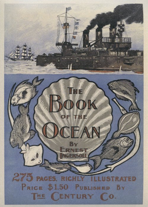
Sailing into November
 Yay, November brings me a book cover I really like! It’s the light periwinkle blue that is the main attraction. It’s also apt, as a periwinkle is a type of sea snail, as well as the more familiar flower. I also like the contrast between the stylised illustration and typography of the title section, and the more realistically drawn ships above.
For those of us in the southern hemisphere it’s also a lovely forecast of summer locales and shoreside festivities to come.
Happy November!
Proof Positive You Can’t Judge a Book by its Cover
 I am most intrigued by this book cover on my April calendar page. ‘Where Ghosts Walk.’ What does it mean, I wonder? Is it a blood-curdling nineteenth century gothic novel set in a monastery, or crumbling medieval mansion? Or is it perhaps a haunting moral tale of love lost and a quest for redemption?
Then I remembered the global librarian, Professor Google, and made enquiries. I was disappointed to discover that the subject of this book published in 1898 is nothing so lurid (or fun). Amazon describes it as ‘The Haunts of Familiar Characters in History and Literature’; one person on Good Reads has rated it two stars, but left no review to explain this scathing dismissal.
Is it a blood-curdling nineteenth century gothic novel set in a monastery, or crumbling medieval mansion?
A subsequent and brief perusal of the first chapter on the Internet Archive did not incline me to read further: it is tedious and the literary style both old-fashioned and laboured. The chapter titles are deceptively enticing however: ‘Her Gloomy Honeymoon’, ‘Dante’s Everyday Wife’ and ‘Told on the Lagoon’ for example. The text does not live up to them. (Feel free to confirm this yourself, but don’t blame me for the minutes of your life lost.)
I wonder if this is why the publishers chose this book cover for the month that begins with a day of trickery? I would have preferred a gothic novel, BUT we can all enjoy the attractive design of the cover – and it proves that old adage of not judging a book by its cover!
Happy April, by the way!


