A Punch in the Eye
 There is jewellery out there that is subjectively unappealing … and then there is jewellery that is unquestionably and irrefutably downright ugly. In the case of the former, there might be someone out there who might like it, in the case of the latter: if you like it, there’s something wrong with you. As one of my friends and I like to say: there’s good bad design, and just plain bad.
An item designed with sound principles in mind* – composition, balance, scale, colour, medium – and executed well may nevertheless be unappealing to some. Beauty is in the eye of the beholder after all. Sometimes it’s a punch in the eye. But when a product is crafted without consideration of these fundamental criteria, then all bets are off. In face of a fan we can presume the ugly product in question is a mirror of their bad taste.
Beauty is in the eye of the beholder after all. Sometimes it’s a punch in the eye.
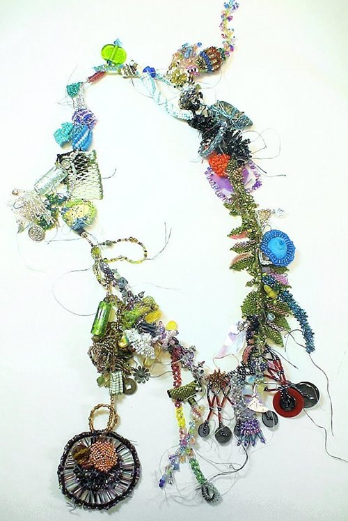
A newsletter from a jewellery supplies website Land of Odds appeared in my inbox this morning, and when I clicked on it I saw an image of an extremely ugly necklace. “Gosh that’s ugly,” I thought, and then saw that it was in fact advertising the annual Ugly Necklace competition that the website runs. This is an interesting challenge; as the competition promoters state: ‘It ain’t easy doing ugly, or as my momma says, “Ugly is as Ugly does.”’.
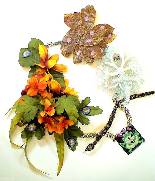
A talented and skilled artisan is not naturally given to creating something ugly. However, there are some who have managed to overcome this natural diffidence.
Although these first three examples of ugly necklaces are undeniably frightful, there is some coherence to their design: the materials used bear some relationship to one another. The last necklace owes its overall ugliness to the juxtaposition of its diverse materials. These separate components broken apart would be repellent enough, but combined into one disparate and ghastly whole, this necklace enters into another realm of ugliness entirely.
Scroll down and you be the judge.
* Click here to read about fundamentals of good jewellery design
All images from Land of Odds Ugly Necklace competition


Drawing Cards
 A while ago I purchased some reproduction vintage playing cards on Etsy (from a store since closed down). The first set is Victorian, circa 1888, while the second is a collection of 1940s pinups. They certainly all have a unique charm, but I adore the Victorian set in particular. I especially love the fact that the suit icons are part of their costume – how cute are the ace of hearts, and the six and eight of clubs?
 And note the difference in the figures of these ladies. Some of those Victorian demimondaine would squash their daintier counterparts! It’s just a pity that the seller didn’t have full sets of either – what a treat it would be to play a game of cards in the company of these risqué ladies.
Check them all out in the Vintage Playing Cards gallery.
An A–Z of Tintypes
 U is for Utensils :: Tinto 1848 // D-Type Film // No flashThe Tintype, still my favourite HipstaPak from the Hipstamatic app, comes with the Tinto 1848 lens and two films: the C- and D-Type Plates, in colour and black and white respectively.
Based on the old Tintype cameras of the mid nineteenth century, the lens cleverly uses iPhone technology to focus on the eyes of a subject and blurs the edges of the frame. The films feature the ragged frames of original tintypes, dirt, dust, scratches and general grunginess – what’s not to love? Who needs the super-sharp clarity of digital cameras, revealing every pore and flaw?
 D is for Dishes :: Tinto 1848 // D-Type Film // No flashI decided to put together an alphabetic collection and searched through my archives for my favourite photos. There were a great many contenders for most letters; a few that I loved far above the rest (U, D, R and T); and a couple that needed a little focused attention (pardon the pun). J and X were difficult. I had to shoot J specifically for this set, and hit upon jewellery as a very likely subject.
 R is for Refraction :: Tinto 1848 // C-Type Film // No flashOf my favourites, the utensils I shot last Christmas at my sister’s house, and the stack of dishes and cutlery in the laundry trough I came upon serendipitously one day in the communal laundry in my block of apartments. R and T were both shot the same day last summer: the refracted light caught my eye in Flinders Lane, and not far away in Federation Square I caught the boy in the striped tee pausing in the threshold of the temporary sculpture Ballroom, by Patrick Dougherty.
 T is for Threshold :: Tinto 1848 // C-Type Film // No flashX was interesting. I really hate those lame ‘x’ words in any A–Z list, especially words that abbreviate the prefix ‘ex’, such as ‘x-treme’. I could do better than that, I decided, and heaved open the OED (the Oxford English Dictionary).
 X is for Xeriscape :: Tinto 1848 // C-Type Film // No flashAdmittedly the words filed under ‘x’ are not easy subjects, but when I came upon the word ‘xeriscape’ I knew I had it. A xeriscape is a landscape of succulents and cacti, both types of plants that I love, and I just happen to live next door to Melbourne’s Royal Botanic Gardens. There is a cactus garden there that I often wander through. I love the utter stillness of it, especially in wild weather when all the other trees around are tossing violently in the wind, and not a breath stirs amongst the prehistoric-looking cacti.
As for the collection, there are some likely suspects, and some not so likely. Click here to look through.
The Tragic Artist
 Jeanne Hebuterne, 1919Today is the anniversary of the birthdate of one of my favourite artists of the twentieth century: Amadeo Modigliani. He is known for the elegant and elongated forms he created as a sculptor and painter. He was influenced by African sculpture, the figurative paintings of the Renaissance, and then by Henri-Toulouse Lautrec and Paul Cézanne, but his own style is unique.
 Kneeling Caryatid
 Nude Bust, 1915Constantly sketching, loving life drawing, he made as mny as a hundred drawings in a day. Yet he was his own hardest taskmaster and harshest critic, and many of these are gone, thrown out by himself – dismissed as ‘childish baubles, done when he was a dirty bourgeois’, lost during removals in his frequent changes of address, or given away to girlfriends and subsequently lost.
 Head of a Woman (reproduction)Modigliani was born in 1884, and died in Paris aged just 35, in 1920. Suffering from TB, he became addicted to the drugs and drink he used to palliate the pain of his illness, which was further exacerbated by overwork and poverty. He lived wildly and to excess, and in a bohemian era crammed with extraordinary talent and lives lived hedonistically, became the epitome of the tragic artist, starving in his attic. But his beautiful work lives on.
Scroll through all his paintings here. Images from Wikipaintings.
Click here for a fashion shoot by British Vogue and Sarah Moon, inspired by Modigliani’s paintings.
 Teresa, (ink) 1915
 Big Red Buste (Leopold II), 1913
 Caryatid, 1911
 Madame Georges van Muyden, 1917
 Portrait of Beatrice Hastings, 1916
 Head of a Girl, c 1918
 Portrait of Jeanne Hebuterne, 1918
 Nude, 1917
Words of Wisdom
 Australian Madison magazine, 2011. Click image for larger version.When you’re young, you sometimes thing there’s some arrival point where suddenly you’re an older person. But now we know it just keeps unfolding. Getting older – it’s really the greatest gift. And that’s the secret no one tells you.
Here’s an uncommon point of view on ageing from actress Annette Bening, now 53. (I must say she was pretty adorable and gamine when she was young!)
I think for me 30 was the Great Age. I thought that would be when I would know everything, and be the woman I wanted to be. Now that makes me laugh! I’m quite a bit older than that now and know that I can – and must – always strive to be more than I am already, because that is the point of a life well-lived. Go forth and conquer, I say.


