Hats On for June
 Vogue’s Late May 1927 elegant and spare cover illustration is by Harriet Meserole, and shows an unusual cloche style (cloches were more typically brimless) in red straw, with a wide, slashed brim. I love Meserole’s illustrations: the lines are always gracious, the shapes stylised and so in keeping with the Art Deco style. I particularly like the touches of periwinkle blue here.
It’s the first day of winter, and aptly I brought my winter hats out of storage, and tried a few of them on today. They were mostly 1940s, although there is one genuine vintage 20s half-cloche in black wool felt, trimmed with grosgrain ribbon that drapes by the left cheek. Quite the opposite of this fresh cover for the northern hemisphere summer. Happy June!
No Really: Falling Down the Rabbit Hole
 I’ve been quiet this month, I know. That’s because I really did fall down the rabbit hole, whereupon I tumbled into a surreal adventure in Wonderland. There’s that old adage, ‘be careful what you wish for’, and re-reading my last story and my blithe words, I have to laugh ruefully. It’s so true.
Here’s to the lovely Australian actress Mia Wasikowska, pictured here peering into the unknown, in Tim Burton’s Alice in Wonderland.
Falling Down the Rabbit Hole in May
 I must say I find this 1945 illustration – the image for May in my Vogue 2014 calendar – by Eugène Berman rather strange and surreal. I am sure it must owe something to Salvador Dalí’s influence. This illustration was chosen for the July 1945 issue of Vogue, the Sea and Country Number.
There are flowers here in the style of Victorian scrapbooking diecuts, and the image is autumnal in tone, but the whole effect is rather gory. The colour is distinctly reminiscent of raw meat, and are those splatters of blood around the edges? Both elements have a rather alarming effect. Perhaps the War had some influence here too.
I am not familiar with Berman’s work, but he and his brother Leonid were Russian Neo-Romantic painters, as well as theatre and opera designers. They fled revolutionary Russia in 1918 for Paris; Eugène left for New York in 1935. His work featured neo-classical elements – lonely landscapes populated with sculptures and architectural features. These were very much in the visceral and energetic style of this illustration, and certainly reminiscent of Dalí.
I very much enjoy surrealism though, especially when it takes the form of strange and adventurous dreams – or real life escapades that make you feel like you’ve fallen down the rabbit hole. Here’s to an intriguing May!
On Training the Eye
 The view from my drawing boardIn general I am not one for representational art, especially hyper-realism – I just don’t see the point when a camera can capture a subject so much more quickly and accurately. There are far more interesting things to explore in art-making than merely drawing something that looks ‘real’.
However, recently it occurred to me that it would be interesting to draw from life once more as a form of discipline. It is too easy sometimes, when drawing from the imagination, to become generic, and therefore uninteresting and repetitive. To draw from life one must train the eye to observe what is there and guide the hand, rather than what one thinks is there.
… one must train the eye to observe what is there and guide the hand, rather than what one thinks is there
One of my favourite mediums to draw in – especially for life drawing – is charcoal, and I like to go quite dark and heavy. Not only to create mood, but to build layer upon layer and subtly shape form out of darkness – like a two dimensional sculpture. I particularly love Georges Seurat’s black and white charcoal drawings for this aspect.
 Egg and silver spoon
 I decided to do some small studies, and in the end completed six over two or three days this past week. They were all small objects, quite different from one another, but all organic matter: an egg on a silver spoon, three cherry tomatoes, a stone sculpture of a horse, a carved wooden Balinese hand, a Chinese calligraphy brush, and a spider seashell.
My drawing board faces a window, so all the items were backlit and quite shadowed, which certainly encourages a heavy hand with the compressed charcoal. I also used a smudgestick for blending (I do use my fingers too) and a kneadable eraser (I love those things!) for rubbing back to create highlights. I really dislike going back and using white conté to create highlights – it creates an ugly whiteish-grey colour. It’s much better to let the paper shine through.

 Drawing flat versus at an easel presents its own challenges, but I am pretty pleased with the results, though some are more successful than others. I wasn’t too hung up on capturing every exact detail – the drawings are small and the charcoal is fat! – rather, capturing the essence of the object was more important to me. I enjoyed myself enormously too. Scroll down to see the finished pieces.
 Moroccan stone horse
 Moroccan stone horse
 Balinese wooden hand
 Balinese wooden hand
 Balinese wooden hand
 Spider seashell
 Spider seashell
 Chinese calligraphy brush
 Chinese calligraphy brush
 Chinese calligraphy brush
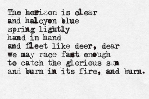
The Horizon is Clear
 The Horizon is Clear :: 14 October, 2012 :: 8:43:49 PMSometimes when I write poems, short or long, they come unbidden out of nowhere, almost as though they have already been written.
They appear fully formed, like those scenes in movies when people are writing a letter, or in their journal, and the handwritten words are superimposed over another image (usually the sky, or a montage of evocative imagery accompanied by grandiose film score), gradually appearing as though a ghostly hand is writing them. This poem was one of those.
I think I must have seen a golden sunset in a blue, blue sky that day. I can almost remember it.
It’s about love of course, a passionate love that will rise above anything, in spite of everything, in spite of the fact that it might die, that we, the lovers might die—and still it burns, and still we hope.
The horizon is clear
and halcyon blue
spring lightly
hand in hand
and fleet like deer, dear
we may race fast enough
to catch the glorious sun
and burn in its fire, and burn.


