Blog Backlog
 After taking a long hiatus from this Sketchbook blog, I have been looking through my backlog and found the last two calendar pages from my 2017 Frankie calendar. Unfortunately I recycled the hard copy and kept no record of who these artists were! As I can’t find them online either, you will just have to enjoy them in anonymity.
November’s pussycat was a serendipitous and penultimate segue to my 2018 calendar of vintage cats. while December’s illustration was an apt forecasting of the coming Australian summer – if I recall correctly it didn’t settle in until January!

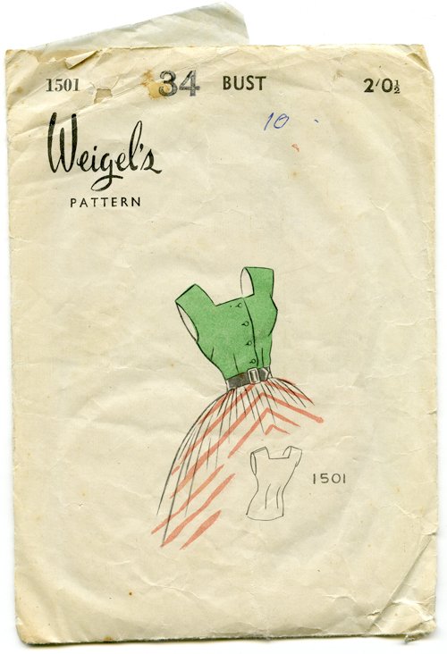
Weigel’s 1501
 Knowing how I love paper ephemera, a friend of mine bought me this quaint 1950s sewing pattern from an op shop (thrift store) a little while ago. I had never heard of Weigel’s Patterns, but their office and factory address – as printed on the reverse – would have been situated twenty-minute’s walk from my home.
Everything about this design is fantastic: the simplicity of the front; the mish-mash of fonts, the strange alignments of the typesetting, varying types of rules, and halftone illustration. Perhaps it is simply the fact it is a relic from a bygone era that makes it so appealing, because no one typesets like this anymore. Have you seen a modern-day pattern envelope? Practicality and clear reference photographs notwithstanding, they are very ugly!
 Don’t you just love that the zip is called a ‘slide fastener’? The word ‘zipper’ or ‘zip’ as it is commonly used in Australia, was actually coined in 1923, by the B. F. Goodrich Company of America. They used the slide fastener on a new type of rubber boot, and referred to it as a ‘zipper’ – and thereafter the name stuck. The word itself is onomatopoeic, meaning it was named for the sound the fastener makes when it is used – a high-pitched zip! [Wikipedia]
This pattern is actually my size, so I think it would have been rather fun to have a blouse made for me – if only all the pieces were there. As it is, I may use the blank tissue inside in my mixed media artwork one day.
Serene Greens
 Interior, 1920
Pinterest gave me a present today, a whole page full of Henri Matisse artworks that I might like! Immediately this painting of a bedroom interior caught my eye, and made me sigh enviously. It just looks so serene and inviting. In fact, a work colleague saw it on my computer screen at a distance and had the same reaction. “I LOVE it!” she exclaimed very positively.
Here is a series of his paintings in similar tones that are equally evocative and sigh-inducing.
 The Terrace, 1906
 The Window, 1916
 The Artist's Garden at Issy les Moulineaux, 1918
 Flowers, 1903
A Period of Quiet Reflection
 October’s calendar page is a little startling at first glance: a young woman, seemingly with prickly cactus growing out of her. If I had written this story on the first of the month, I might have said it is an apt depiction of what some people go through with the onset of spring: hay fever.
Then yesterday, I might have said it was an accurate expression of many people’s feelings on hearing of yet another horrifying and heartbreaking shooting in America.
Today I have looked up the artist, Choi Mi-Kyung, who paints under the pseudonym Ensee, and I can find out little about this Korean graphic designer and illustrator who hides her face on her own website. She works digitally, and all her images display a similar, delicate aesthetic and subdued subject matter: ethereal girls (and occasionally boys) partially hidden behind foliage, birds, domestic scenes.
The pictures, especially viewed en masse, make one pause, and open a window into quiet reflection and tranquillity – a welcoming sense of stillness in today’s chaotic and sometimes disturbing world. It may even soothe the soul.
Rebels of Colour
 Study for the Portrait of Madame Heim, 1926I was going to write a story on the inspirational Sonia Delaunay, one of my favourite artists and textile designers, but instead I discovered the work of her husband Robert, with which I had been hitherto shockingly unfamiliar. I don’t even recall studying him when I was at art school!
Robert Delaunay (1885–1941) was born in Paris, and after his parents divorced, was brought up by his aunt and uncle, who sent him to study Decorative Arts at Ronsin’s atelier in 1902. At age 19, he left the atelier to focus entirely on painting, and in subsequent years was contributing paintings to the Salon des Indépendents.
 Portrait of Henri Carlier, 1906His Neo-Impressionist style employed the use of mosaic-like cubes to form his small but intricate paintings, and he was linked with the Cubists, but in 1911 (by this time married to Sonia) his work became nonfigurative as he explored the ‘optical characteristics of brilliant colour that was so dynamic they functioned as form’. [Wikipedia] He and Sonia, along with others, founded Orphism, an offshoot of Cubism, which focused on pure abstraction and bright colours.
 The First Disk, 1913
 Circular Forms: Sun No 1, 1912–13In 1912, Delaunay said, ‘I made paintings that seemed like prisms compared to the Cubism my fellow artists were producing. I was the heretic of Cubism. I had great arguments with my comrades who banned color from their palette, depriving it of all elemental mobility. I was accused of returning to Impressionism, of making decorative paintings, etc … I felt I had almost reached my goal.’ [Wikipedia]
‘I made paintings that seemed like prisms compared to the Cubism my fellow artists were producing.’
Delaunay went on to be invited by Wassily Kandinsky to join Die Blaue Reiter (The Blue Rider), a Munich-based group of abstract artists, and to enjoy success in Switzerland and Russia as well. Orphism as a movement however was short-lived, losing its novelty as a new artistic style, coming to an end before the onset of the First World War. Despite this, both the Delaunays essentially adhered to its theories in their subsequent work.
 Astra (also known as Study for 'The Football Players of Cardiff'), 1912–13 While living in Madrid during WWI, Delaunay was stage designer for Sergei Diaghilev on the ballet Cleopatra; Sonia did costume design. While he continued to paint after the war, he also was involved in the design of railway and air travel pavilions for the 1937 World Fair in Paris. He died at age 56 in 1941 from cancer.
I love the idea that the Delaunays, and others of their group, were boldly running complete counter to their contemporaries, such as Picasso and Braque, and pursuing their own vision in celebration of colour for its own sake. And why not? The world would be a dreary place indeed if it was seen only in black and white.


