Alice’s Adventures on Film
 Tatiana's adventures inside a sandwich boardOne of my favourite childhood books was Lewis Carroll’s Alice in Wonderland. So I was very much looking forward to seeing the Wonderland exhibition at the Australian Centre of the Moving Image (ACMI), which explores the many adventures of Carroll’s famous story on film.
 The disorienting mirrored Hallway of Doors
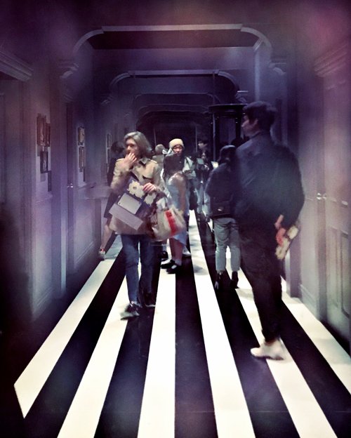 Looking through the two-way mirror into the Hallway of DoorsBeginning with the Hallway of Doors (enter by the smallest door, no matter how old you are), is a series of fantastical rooms, with names such as ‘The Pool of Tears’, ‘Looking Glass House’ and ‘A Mad Tea Party’. On show is charming footage from the late nineteenth century to the multitude of iterations produced in the century since, as well as a plethora of other material such as Charles Dodgson’s original concept drawings, magic lantern projections, vintage posters, animation cels, puppets, props and costumes.
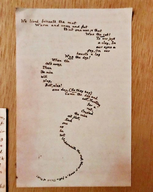 This was always my favourite page in the book when I was very little, so I was thrilled to see Charles Dodgson's original drawing, c1862–64The exhibition is immersive from the get go. On entrance, each attendee is given an ‘enchanted Lost Map of Wonderland’ that unlocks additional surprises with the aid of digital scanners in different rooms of the exhibition – if you could get past the kids hovering over the scanners.
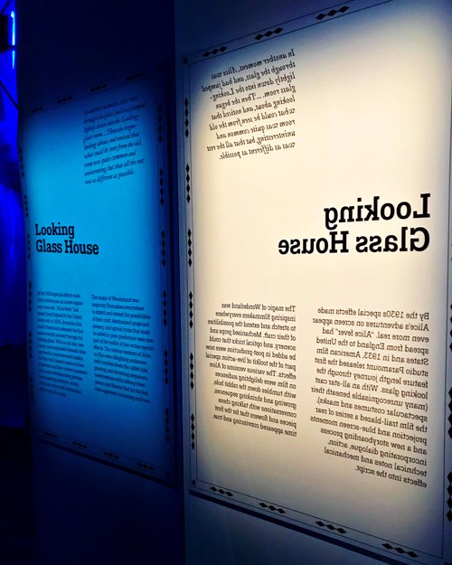 Looking Glass House; the exhibition's curation is thoughtful and thorough, and the design is clever and entertaining for young and old
 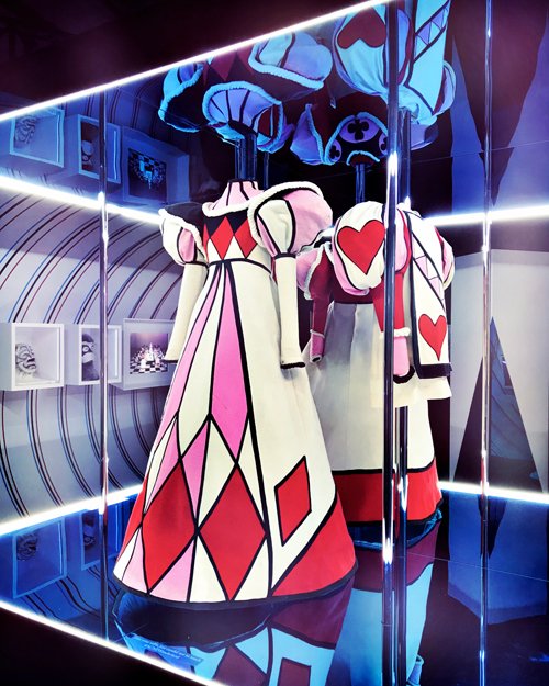 Queen's costumes in Looking Glass HouseThere are also several video installations, and my favourite was at the end, a montage of footage from film, television and advertising showcasing how the story of Alice has entered and utterly saturated popular culture to the present day. I could not help picturing how astonished and gratified Dodgson would be if he could see how far in time and space his story has reached.
If you are in Melbourne, the exhibition is running at ACMI every day of the week until 7 October, and is a must-see.
 Clocks
 Inside the video installation of A Mad Hatter's Tea Party
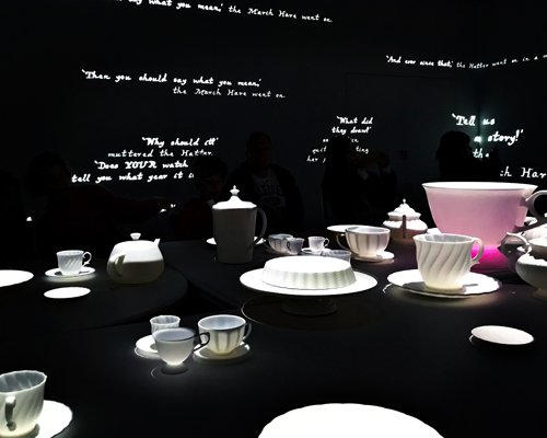 Inside the video installation of A Mad Hatter's Tea Party
Killer Diller
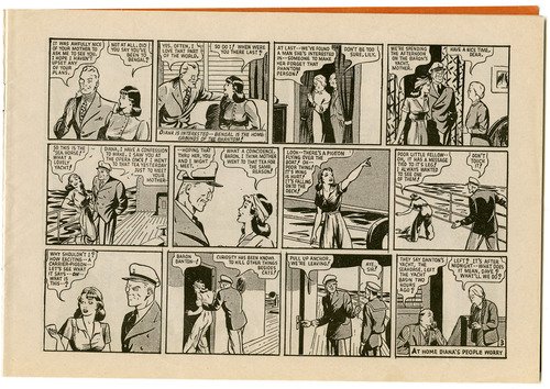
 When I was a young teen I went through a short period of enjoying reading the adventures of The Phantom. Those comics were probably my last foray into graphic novels, but apart from the adventuring itself, the vintage forties illustrations were particularly appealing.
 Click on the images for larger versionsOn the weekend I picked up a reproduction comic of The Phantom Versus “the Spy Ring” in an op shop for $1, and had fun reading it late yesterday evening. While this story came to a satisfactory conclusion, I had forgotten that these were serial! Damn. Now I’ll always wonder if the Phantom ever ran the spy chief Baron to ground.
I was glad however that his fiancé Diana featured prominently in this story, for I enjoyed her 1940s fashions, especially this beach pyjamas ensemble complete with headscarf and high heels that she wore on the dastardly Baron Danton’s yacht.
I have always hankered for a pair of beach pyjamas, but feel stymied not only by their rarity and expense, but the lamentable fact that any vintage jumpsuit I have tried on has proven to be too short in the body for me. You can see it a bit better in this detailed scan below.
In 40s parlance, aren’t they just killer diller*?
* That would be amazing.
A Match Made in Wonderland
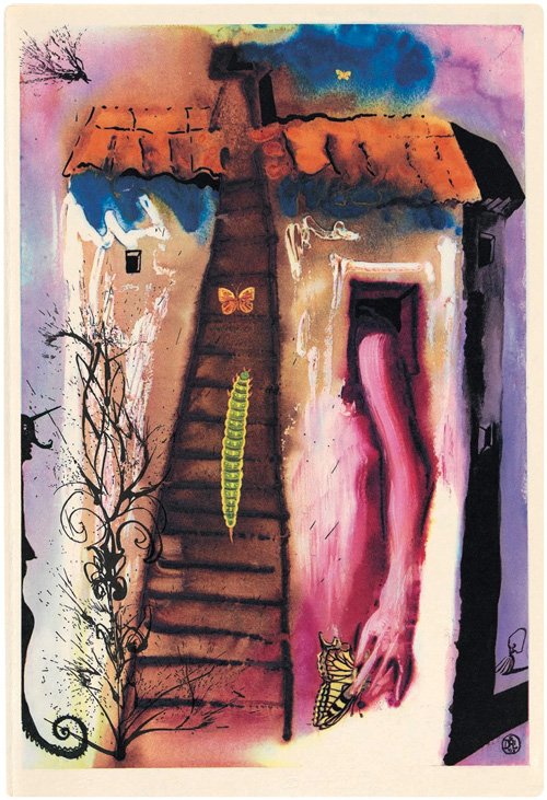
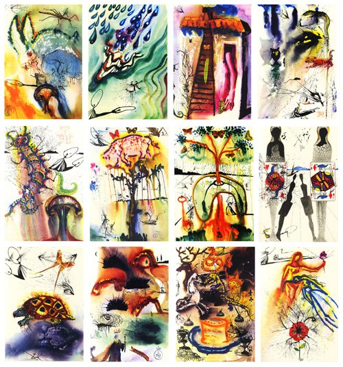
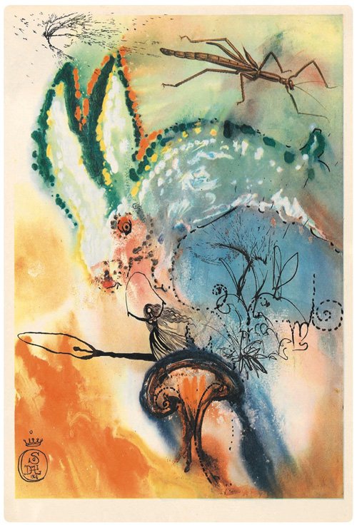 While I am not a big fan of Salvador Dalí’s work, I must admit that pairing him with Lewis Carroll’s Alice’s Adventures in Wonderland (a childhood favourite of mine) was a stroke of brilliance. An editor at Random House commissioned the artist to illustrate an exclusive edition of the book in the 1960s, with all copies signed by the artist.
 The book celebrated its 150th anniversary two years ago, and this edition was was published for the public by Princeton University Press. Currently in Melbourne, the Australian Centre of the Moving Image is presenting a world premiere exhibition celebrating the tale as it has appeared on film, so I’m keeping my fingers crossed that this book might be amongst the merchandise on sale.
Here is the phantasmagorical result of Dalí’s reimaginings of the famous tale. Read more here.
Looking the Right Way
 A while ago, a friend shared this pebble alphabet by Belgian designer Clotilde Olyff. Amazing! I said, assuming the image was Photoshopped. But no, it turns out that Olyff, a typography designer, spent 14 years collecting real, actual pebbles off the banks of rivers and beaches. That is dedication!
Here is an extract from Jan Middendorp’s essay Lettered (2000) about Olyff’s alphabet of stones:
Clotilde Olyff is no reader. She is not at ease with sentences, and not particularly fond of words. She is troubled by letters when arrayed for battle, preparing to strike the reader as useful information or gripping ideas. But she is positively in love with the letter as an individual, fascinated by the infinite possibilities in suggesting its forms, eager to discover its features in the faces of strangers. Even though she makes a living by creating and re-creating letters, the way we perceive these forms continues to fill her with wonder.

Is it our obsession with communication that makes us look for the alphabet in the simplest of forms – circles, triangles, squares? Does it take a particular type of madness to comb the beaches of Les Landes in search of letters created, so casually, by the forces of nature and time?
The pebbles Clotilde Olyff discovers are the product of chance, yet they seem made to be singled out; to be recognized as faces … typefaces or human faces. Like a child pointing out oddly-shaped clouds, Clotilde Olyff shows us that nature can imitate art, instead of the other way round – if you look at it the right way.
The entire natural world is full of wonder indeed – if you look at it the right way.
A Delightful Little Diva
 Oh, this illustration makes me chuckle – it’s delightful and funny. I once new a white cat just like this one, called Diva, and that naughty child is certainly being a bit of a diva!
This is the picture on the August page of my calendar, and it is a pleasant one to look at. The linework is masterful, as well as the trick of filling the negative spaces with a lovely palette of colour and pattern, and allowing the white of the page to fill the positive. It’s a very effective technique. Unfortunately, the calendar does not include illustration credits, but this looks 1920s or 30s to me.
Happy August, dear readers!

