The Last of Summer
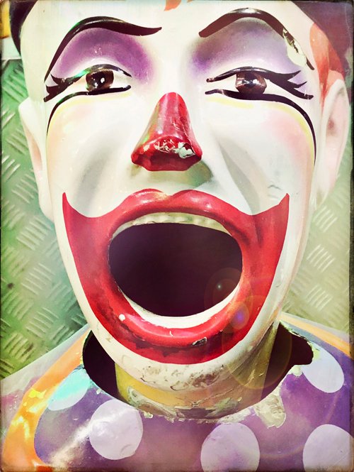 Nostalgia, Day 10, March 2019I had a lot of fun producing my third set of the 30 Day Photo Challenge. The vivid colour and what I call the ‘glowy’ effect of my chosen combination of Hipstamatic equipment were very inspiring. I hit on the combination by chance, using the random button on my self-portrait photos of the first day.
It was a beautiful late afternoon, and I took the shots on a bridge where I was bathed in the light of the setting sun. The Leonard lens creates a complex layered texture that looks like a shimmering bubble, and also adds the occasional flare to which the Standard flash adds even more brightness; they are offset by the weathered Sussex film, a great textured base with burnt edges. It felt like the right blend to celebrate the last of summer.
 Self Portrait, Day 1, March 2019The funfair clown is one of my favourite images, and evokes the Nostalgia theme perfectly, reminding me of attending summer carnivals in my childhood, where the air itself was charged with excitement, and all the crowds, colours, lights and noise thrilled me. Carnivals were places full of possibility and adventure. I still love attending them to this day, and enjoyed my perambulations through the Moomba carnival, just taking photos – it was hard to choose between the ferris wheels, dodgem cars and other rides, but as I came to the laughing clowns, I knew they were It.
Click here to view the whole gallery.
Proof Positive You Can’t Judge a Book by its Cover
 I am most intrigued by this book cover on my April calendar page. ‘Where Ghosts Walk.’ What does it mean, I wonder? Is it a blood-curdling nineteenth century gothic novel set in a monastery, or crumbling medieval mansion? Or is it perhaps a haunting moral tale of love lost and a quest for redemption?
Then I remembered the global librarian, Professor Google, and made enquiries. I was disappointed to discover that the subject of this book published in 1898 is nothing so lurid (or fun). Amazon describes it as ‘The Haunts of Familiar Characters in History and Literature’; one person on Good Reads has rated it two stars, but left no review to explain this scathing dismissal.
Is it a blood-curdling nineteenth century gothic novel set in a monastery, or crumbling medieval mansion?
A subsequent and brief perusal of the first chapter on the Internet Archive did not incline me to read further: it is tedious and the literary style both old-fashioned and laboured. The chapter titles are deceptively enticing however: ‘Her Gloomy Honeymoon’, ‘Dante’s Everyday Wife’ and ‘Told on the Lagoon’ for example. The text does not live up to them. (Feel free to confirm this yourself, but don’t blame me for the minutes of your life lost.)
I wonder if this is why the publishers chose this book cover for the month that begins with a day of trickery? I would have preferred a gothic novel, BUT we can all enjoy the attractive design of the cover – and it proves that old adage of not judging a book by its cover!
Happy April, by the way!
A Rainbow of Happiness
 To celebrate the International Day of Happiness, I have made a little slideshow of some of my travel photos, taken in Vietnam, Hong Kong, Portugal, Morocco and my hometown of Melbourne. I call it a six second rainbow of happiness!
I hope you have been able to do something that makes you happy today.
Drawn to Lines
 Femme se reposant, 1937
Henri Matisse (1869-1954) is one of my favourite artists. One of the Fauves, he was famous for his use of colour, and was known mainly for his paintings, but I in fact love his drawings, sketches and paper cutouts even more. The quote below from an article in The Boston Globe about an exhibition of Matisse’s drawings describes their elegant purity so perfectly:
The drawings of Henri Matisse must surely be among the most beautiful objects made by any human hand in the 20th century — or, come to think of it, ever. You look at them, you register their legendary ease and simplicity, and it’s very easy indeed to take them for granted — to assume that in some strange way they were born and not made.
Matisse’s characteristic line, at once classically concise and dreamily unmoored, has in that sense become a cliché, part of the visual air that we breathe. [Sebastian Smee, from The Boston Globe]
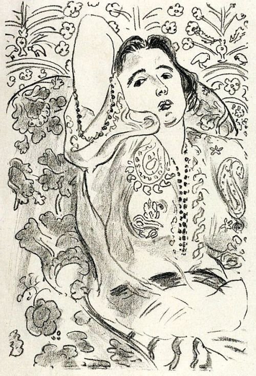 Arabesque, 1924
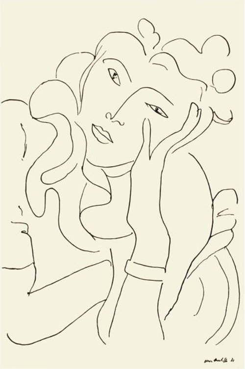 La Fleur, 1937
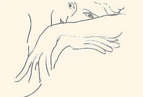 The Handkerchief, 1935
 The Romanian Blouse, 1942I have been using Pinterest actively only for a year or two, and began mainly for the purposes of research. The more I used it of course, the more personalised my home page became: amongst a sea of vintage hats and fashion, out pop the works of Matisse, and in particular his line drawings, sketches and cutouts. With time, it’s been interesting to see the algorithms at work, refining my homepage according to my personal aesthetic. Obviously, the more Matisse drawings I saved – the ones I was naturally drawn to – the more I was shown. Then my love of Matisse drew in other artists who also employ linework in their art (more on them another time).
I don’t know how many artworks Matisse made – they seem innumerable, and he kept on working almost until his death at 84, but here are a few of his monochrome drawings that I like.
(All images found on Pinterest. I have tried to discover the correct titles and dates for each work, but searching in the Google is like looking for a needle in a haystack sometimes, and there are a few which don't include full information.)
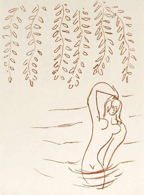 Hanging branches, 1948
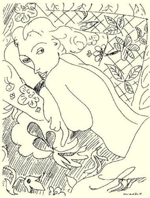

 1942
1942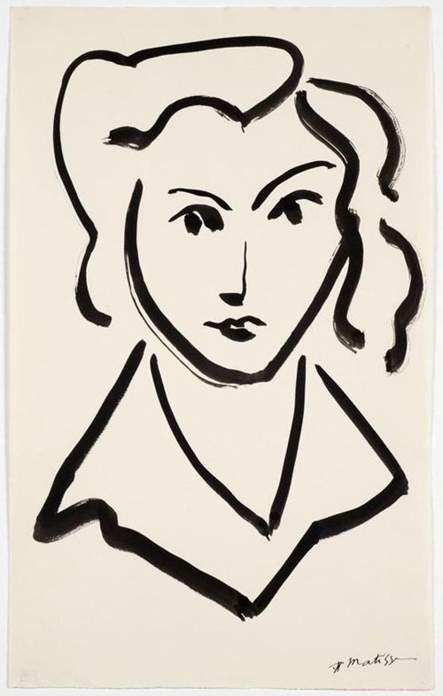 Tete de femme (Head of a Woman)
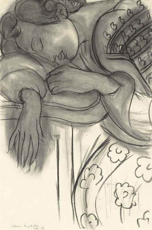 Étude pour La Dormeuse, 1939
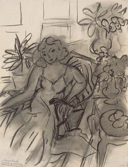 Femme au fauteuil, 1941
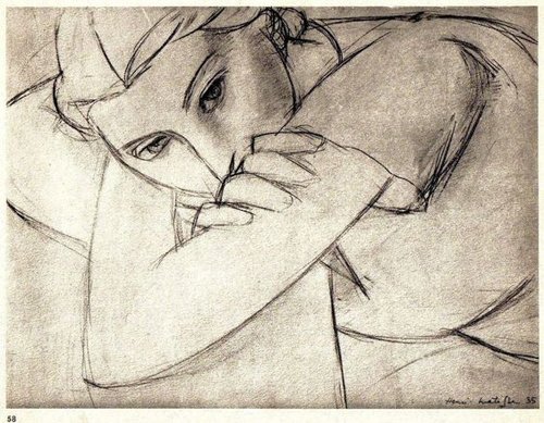 Lithograph, 1935
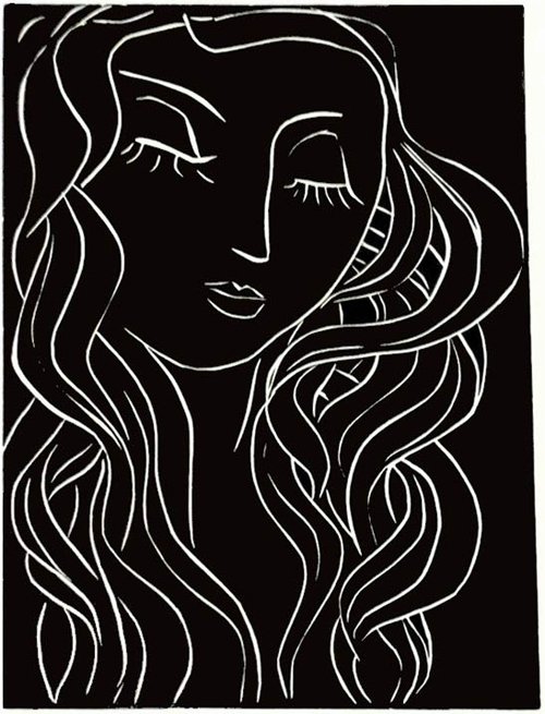 Linocut; Sleeper with the long eyelashes, 1944
Thirty Days
 January, Day 28: LiquidLate last year when I was thinking about New Year’s resolutions, I decided I needed a new creative challenge. For two years in a row I had been fulfilling my 2017 resolution of a poem a day, but it was time for something different, although of course I would keep writing regardless.
I take photos every day, if nothing else for my on-going Lost Things project, but I hit upon the idea of a ’30 Day Photo Challenge’. I had come across the concept here and there in the past, and a little research on the Google brought up various options on Pinterest. I quickly decided I didn’t like any of them in their entirety, and wrote my own subjects, trying to keep them fairly broad and open to interpretation.
 January, Day 10: NostalgiaAdditionally, I decided to complete each month using the same equipment in Hipstamatic in its entirety – that would make approximately twelve, visually cohesive sets. (Because I am rolling over each thirty days immediately rather than waiting for the first of the month, I will finish up the twelve sets a bit before the end of December.)
 February, Day 6: Morning In January I used Hipstamatic’s moody, vintage-style Tintype ‘pak’ with desaturated tones and short depth-of-field; and in February I chose a green-tinged combination which evokes for me blissfully lazy, sun-dappled summer days. I didn’t use any flashes in the January set, but the February set is a mixture of no flash, and various coloured flashes in the Hipstamatic app’s arsenal.
Here are a few samples, and to view the full sets, go to my new 30 Days Photo Challenge gallery page. These will be updated each month, so do come back to take a peek at my 2019 visual diary again.
 February, Day 25: Upside Down

