(Mon) Art Nouveau
I have loved experimenting with my typographic illustrations so far. The swooping and swirling text style is based on my own handwriting – an exuberant version of it – so it has come quite naturally to me …
Book cover design for Charles Beaudelaire's ‘Les Fleurs du Mal’
I have loved experimenting with my typographic illustrations so far. The swooping and swirling text style is based on my own handwriting – an exuberant version of it – so it has come quite naturally to me. However, it was not lost on me that this organic style is reminiscent to the Art Nouveau movement of the late nineteenth century, not so much the real typography of the period, but the decorative aesthetic.
I decided to apply the style in a book design, and landed on Les Fleurs du Mal by Charles Beaudelaire. Although the poems are from an earlier period, the title seemed particularly evocative and perfect for Art Nouveau, which was greatly influenced by the sinuous shapes in the natural world.
The overall design came together easily enough, but it was the flowers that gave me the most grief. In my original sketch, I had just drawn stylised flowers, but quickly decided that they needed to be more interesting, which meant realistic; my friend suggested Canterbury bells. This was much more helpful as I was able to use real reference to draft the flower from different angles more convincingly.
The original rough, with replacement flowers (right) based on Canterbury bells
The snake is based on the blue viper (Google it and be amazed by the gorgeous ranges of blue, aqua and jade of its skin), and then I had only to decide how many of the flourishes would take the form of snakes. The intricate intertwining of the different elements gives me joy!
Another struggle I had been contending with for months was Adobe Illustrator, which I was using to create the vector art. The latest versions (28.3–28.7) have a horrible bug that makes it extremely difficult to pick up anchor points and handles with the direct selection tool – it would take at least three attempts every. single. time. You can imagine how that lengthened the task of drafting such typography.
It has been the cause of enormous frustration and even physical pain in my hand and wrist from the stressful gripping of my Wacom pen. I was finally able to get hold of Adobe’s technical staff (after being ignored for months by them on the community forum), and the solution turned out to be to downgrade to vs. 28.2. After that, I was able to pick up anchor points and handles at first go, and I was able to complete the artwork with brilliant ease. It felt like a miracle! In fact, I almost sobbed in relief. Apparently – I read in an email this morning – the Adobe development team are working to iron out this flaw. (You can read more about it here.)
When the vector art is complete, I import it as layers into Photoshop and proceed to apply the textural effects and toning. Keeping the artwork as paths means it’s really easy and quick to experiment with different colours. In this case it was mainly the background and text colour I played with to achieve the right balance of alluring brights and muted shades for an unusual and slightly uneasy colour palette that suits the subject. I’m really pleased with the final result.
Read More!
As I have continued to develop my risoprint illustration style, I wanted to work on something a little more conceptual than alphabet cards (as fun as those are). Last week I was reading something – I can’t even recall what it was, but it must have been erudite! – and the thought came to me: ‘Read more, get smarter’ …
As I have continued to develop my risoprint illustration style, I wanted to work on something a little more conceptual than alphabet cards (as fun as those are). Last week I was reading something – I can’t even recall what it was, but it must have been erudite! – and the thought came to me: ‘Read more, get smarter’. Immediately following that was, ‘Hey, that’s a good idea for an illustration!’
I sat down to sketch up some ideas. The first one was easy, inspired by my eclectic taste in reading, as I like to dip in and out of different books depending on available time and mood. Some of my books are unputdownable (Agatha Christie), others are taken in little daily bites (poetry, essays) and others I open sometimes (history, psychology, philosophy).
Not many would know this about me, but when I was in my mid-20s, I did a short course on counselling, which provided an overview of the different streams of therapy; it also lead to a casual dipping into philosophy. Although I decided at the time not to pursue another career, the interest remains. It amused me therefore to juxtapose my fictional (ahem) reader reading two antithetical books at a time.
The second illustration was literally inspired by my own perpetual piles of books on the go that are scattered around my apartment, the idea being that one doesn’t have to be a pedant or snob about reading material. Pick a book, any book, and just dive right in.
Originally I was going to put my favourite books on the spines, but realised clearly they needed to relate to water in some way. I’ve only read two of these – Rites of Passage by William Golding (a favourite author, and this book was unputdownable; I think I randomly picked up the book while on holiday somewhere and ended up riveted), and Robert Drewe’s The Drowner. I read it not long after it was published in 1996, and remember nothing of it now, except that I assume I enjoyed it as it is still on my shelf, and not donated to a charity shop.
Booksellers love to promote books in summertime, since many people are on holiday then, but why wait? Go on – DIVE RIGHT IN, RIGHT NOW.
Scarier than Darth Vader
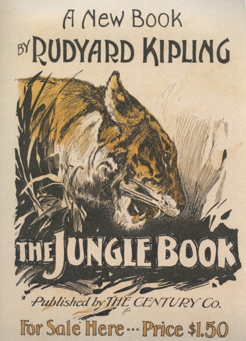
 I have never read Kipling’s The Jungle Book. Like many though, I have seen the Disney animation. It was one of the first films I saw; reading a little about the synopsis makes me realise I retain absolutely no memories of it. What I do remember is being very cross because my sister made me go and see that instead of the original Star Wars with her and my cousins, citing that I was too young for violent science-fiction. (I was even crosser when I saw a boy about my age exit the cinema, having seen it and clearly suffering no ill effects.) But however childish I thought it was, I am sure I must have enjoyed The Jungle Book.
I am amused to compare some stills from the film with the cover art of this nineteenth century publication. That tiger looks scarier than Darth Vader. Compare its animated counterpart:

Cuddly, right?


I think I need to take a trip down memory lane and rewatch some of these childhood perennials.
This may be the last calendar picture I share for a while, as I recently found a vintage perpetual calendar in a thrift store, and plan to try using that next year. I rarely write on the actual wall calendar, using my phone diary as a planner, so it seems a little pointless to have one, apart from enjoying the pretty pictures every time I turn a month over. I expect I will often forget to move the paper cogs on the perpetual calendar however, but we shall see.
Happy December!
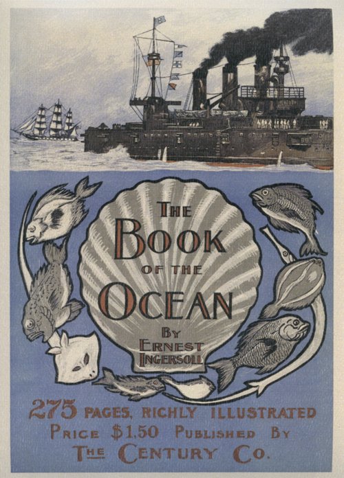
Sailing into November
 Yay, November brings me a book cover I really like! It’s the light periwinkle blue that is the main attraction. It’s also apt, as a periwinkle is a type of sea snail, as well as the more familiar flower. I also like the contrast between the stylised illustration and typography of the title section, and the more realistically drawn ships above.
For those of us in the southern hemisphere it’s also a lovely forecast of summer locales and shoreside festivities to come.
Happy November!
The Adventurers

Could any books seem more dissimilar? The book cover on this month’s calendar page makes me laugh, evoking as it does a story of adventurers, involved in desperate deeds. A quick read of its Wikipedia entry reveals that this book, published in 1906, is based on a true story set in Alaska about corrupt government officials seizing gold mines from prospectors. It has been made into five movies, the last being in 1955, which makes it ripe for yet another Hollywood remake.

September’s book cover, The Doctor, by Ralph Connor – which I endeavoured to ignore for the entire month – struck me as drearily designed in brown monotone. It was published in 1907, and according to reviewers on Good Reads, it is a worthy moral tale about a young countryman who overcomes poverty to realise his dreams of becoming a doctor and travelling the world.
I feel no hankering to track down and read either of them, but I certainly prefer to look at the more promising red cover.
Happy October!


