Review: Anna Karenina
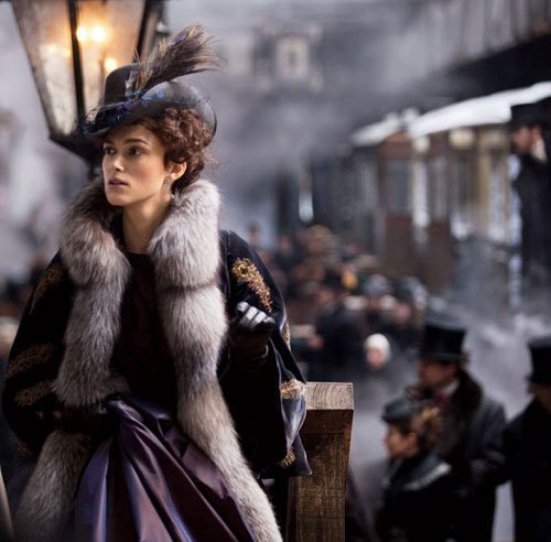 On Saturday night I saw Anna Karenina. I had heard mixed reviews and was dubious about the much-talked-about staging, but I was curious and very interested to see the result at last, albeit so late in the season. Here’s what I thought …
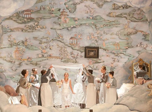
Despite my misgivings, I was immediately captured and entranced by the opening scenes. Set on a nineteenth century proscenium arch stage, with the hustle and bustle of scene-changers and characters wandering about backstage and along the precarious wooden gantries above, this is a metaphor neatly dividing Moscow and St Petersburg in their two worlds of rich and poor, of artifice and harsh reality.
 It was a well-made film, beautifully filmed and edited with mostly competent performances; visually and stylistically it was quite poetic. But even as I marvelled at its cleverness, I am not sure if the Joe Wright and Tom Stoppard were successful in distilling the essence of Tolstoy's book.
I questioned some of the casting: I was never convinced Keira Knightley was the best choice for the title role, and Jude Law seemed an unusual choice as Karenin (not to mention ironically inapt). However Aron Taylor-Johnson, playing Vronsky, seemed suitably vain and effeminate, not virile at all – though Law's castrated Karenin was virtually sexless. It was certainly a subtle portrayal by Law and drew great sympathy from me, but his Karenin did no justice to Anna and very little to cast her character in a flattering light. Karenin was a hard, unsympathetic man, many years Anna’s senior, but it was difficult to see him as anything more than hard-done-by. And Knightley’s Anna, overwhelmed by love and passion, did nothing to convey the anguish she suffered at the loss of her son, the torment of fearing she would lose Vronsky (which eventually unhinged her), and the depths of humiliation she suffered at society’s rejection of her. In effect, she was shallow and rather selfish.
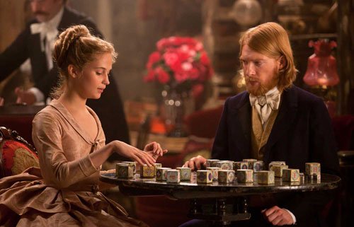 In Tolstoy’s book, the sweet purity of Levin and Kitty's marriage is juxtaposed against the dishonourable nature of Anna and Count Vronsky's relationship (according to the mores of the day), but I do not think this was adequately conveyed to a modern audience – if even it could be judging by the reactions of some of the patrons in the cinema the night I saw the film. One of the tenderest scenes was played out between Levin and Kitty when they reveal their love for one another using alphabet blocks – including a very cute nod to modern texting parlance with the blocks spelling ‘ily’.
Although the stylised presentation of the story helped to truncate Tolstoy's book (and rationalise yet another production), occasionally there were jarring interludes – notably Levin's meetings with his brother – that made me wonder why they had been put in, because they were simply not adequately fleshed out.
The stage setting was utilised beautifully, from how sets were changed (backdrops, scenic art, doors opening on new scenes), to the use of space (the stage, backstage as well as the seating area), minor actors' roles seamlessly changing. The choreography and film editing was breathtaking in its perfection.

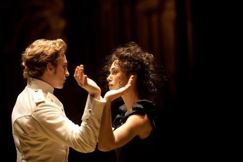 Sound – and silence – was used to great effect: clerks stamping paperwork in tune, the rapid beat of a fan in time with panicked breath and heart. The ball scene when Anna and Alexey dance for the first time was brilliantly portrayed, with Kitty changing partners as the lovers continually swirl around in the middle, deaf and blind to their surroundings – the set darkens and Anna and Vronsky dance alone in the darkness until they gradually return to the hubbub.
Joe Wright … has nevertheless created a a cornucopia of deilghts in this film of great beauty, rich detail and real originality.
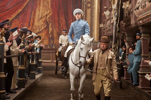
 The crowning achievement was the stylised staging of the horserace, with spectators sitting in the theatre seats before the stage, and only the sound of the horse’s hooves thundering in the darkness of ‘offstage’ hinting at reality.
This is a story of such scope it would be difficult for anyone to truly do it justice, and Joe Wright, though he has succeeded only in part, has nevertheless created a a cornucopia of deilghts in this film of great beauty, rich detail and real originality.
Inter-Universe Beauty Wrap-Up
 Meet Miss Inter-Universe of 4082, Louella Brite!The Inter-Universe Beauty Pageant of 4082 (hosted by Earth) is over! The judges (I, and three of my female cousins) have tallied the votes (my childhood first, second and third place school sports ribbons were used to distribute the votes), and apart from one green ribbon which seems to have gone astray, here are the results:
Miss Lorna was the over all winner, with two blue ribbons, and two red. She was one of the very last I drew, and I remember putting a great deal of effort into her hair, makeup and costume.
To my disgust (then as now) Miss Comet is First Runnerup – long blond Rapunzel hair, big dress and diamonds plastered over her … how predictable. She received two blue ribbons and one red. None of those were from me.
Second Runnerup Miss Venus received one red and one green ribbon, and Miss Saturn and Miss Uranus tied for equal fourth with each receiving one green.
It’s good to see that even in that day and age green-skinned people aren’t discriminated against …
Now that I see them all side-by-side it’s interesting to discover there is a preponderance of yellow and green tones amongst the winners, excepting the shrimpy Miss Saturn. It’s good to see that even in that day and age green-skinned people aren’t discriminated against also – there are two greenies in the winning circle.
Well folks, I guess that about wraps it up. See you all at the pageant on the rainforest planet Lorna next year!
View the full Galaxy Gallery here.
Frosted Fairytales
 Sweet and happy stories set in lollypop land are boring. Who wants those? Oh hang on, except for the lollypop land bit. That part is good.
From donuts that fly to lolly-men that lob raspberries, the creatures of Nicoletta Ceccoli’s (a fairytale name in itself if ever I heard one) inhabit strange and sinister landscapes that are coated in sweet candy colours and dipped in frosting; in which sugar seems to be the dark lord, and where very bad things happen to cakes.
sugar seems to be the dark lord, and … very bad things happen to cakes
 Ceccoli is an Italian artist, born and bred in San Marino. She studied animation in the Institute of Art in Urbino, Italy but afterwards moved on to illustrating books, the most recent of which is Cinderella. Her work has been exhibited internationally and won her many awards. Ceccoli’s fantastical world is populated by hybrid creatures that – were it not for her subdued but sweet colour palette – could easily dwell in a dark netherworld.
Look at these pictures late at night and maybe, if you’re lucky, you might step into one in your dreams.
These are a few of my favourites. See more of her mouth-watering work on her website.


Eggs for Art’s Sake
 She Crushed His Heart Like a Bug (detail)Continuing my theme of broken hearts and clichés of love comes She Crushed His Heart Like a Bug, a mixed media piece made with love from 80-odd-year-old paper torn from a romance novel, pen and ink, red foil, grey thread and vintage lace. (Yes Mr Taxman, I really did buy those chocolate strawberry-cream filled Easter eggs just for my art.)
I very much enjoyed making this piece – even if sewing those fishnet stockings was torturous on such fragile paper – and had a good giggle. Not that there’s anything funny about crushing hearts underfoot of course*.
* No hearts were harmed during construction of this piece of art.
 She Crushed His Heart Like a Bug
 She Crushed His Heart Like a Bug (detail)
 She Crushed His Heart Like a Bug (detail)
Twilight
 Last weekend I visited the Castlemaine Autumn Festival for a daytrip with two of my sisters and my brother-in-law (the chauffeur). We had a lovely time wandering around this quaint country town, listening to some great music, enjoying some delicious food, browsing in vintage stores and quirky boutiques, and gallery-hopping.
 Out of all the galleries that were within walking-distance, the exhibition I most enjoyed was Carolyn Graham’s linocuts in Between Daylight and Dark, showing at the Falkner Gallery.
It’s not often I go for landscape art, but these are anything but traditional with strong and stylised shapes in a palette of grey and green. Most of the pieces were landscapes of rolling hills, and stark silhouettes of trees, but there were a few enjoyably quirky creatures too, such as this rabbit (below). It’s refreshing to see linocuts as opposed to etchings (as much as I love these) and prints that take such a painterly approach too, thus achieving a softness that is rarely seen in linocut printing.


