Woman in Red Tights
Today I thought I’d work on an illustration with some fashion content …
Today I thought I’d work on an illustration with some fashion content. One of the ideas I’d noted was a woman sitting cross-legged on the floor wearing tights; I’d seen an ad on social media for a brand of hosiery, and thought it would make a fun subject for illustration.
The original sketch
I deliberately chose not to do this in a painterly style. I wanted something quite graphic and flat, with an interesting interaction of negative space, and an off-key colour palette. I resisted the impulse to add more tone, and I am quite pleased with the result.
Read More!
As I have continued to develop my risoprint illustration style, I wanted to work on something a little more conceptual than alphabet cards (as fun as those are). Last week I was reading something – I can’t even recall what it was, but it must have been erudite! – and the thought came to me: ‘Read more, get smarter’ …
As I have continued to develop my risoprint illustration style, I wanted to work on something a little more conceptual than alphabet cards (as fun as those are). Last week I was reading something – I can’t even recall what it was, but it must have been erudite! – and the thought came to me: ‘Read more, get smarter’. Immediately following that was, ‘Hey, that’s a good idea for an illustration!’
I sat down to sketch up some ideas. The first one was easy, inspired by my eclectic taste in reading, as I like to dip in and out of different books depending on available time and mood. Some of my books are unputdownable (Agatha Christie), others are taken in little daily bites (poetry, essays) and others I open sometimes (history, psychology, philosophy).
Not many would know this about me, but when I was in my mid-20s, I did a short course on counselling, which provided an overview of the different streams of therapy; it also lead to a casual dipping into philosophy. Although I decided at the time not to pursue another career, the interest remains. It amused me therefore to juxtapose my fictional (ahem) reader reading two antithetical books at a time.
The second illustration was literally inspired by my own perpetual piles of books on the go that are scattered around my apartment, the idea being that one doesn’t have to be a pedant or snob about reading material. Pick a book, any book, and just dive right in.
Originally I was going to put my favourite books on the spines, but realised clearly they needed to relate to water in some way. I’ve only read two of these – Rites of Passage by William Golding (a favourite author, and this book was unputdownable; I think I randomly picked up the book while on holiday somewhere and ended up riveted), and Robert Drewe’s The Drowner. I read it not long after it was published in 1996, and remember nothing of it now, except that I assume I enjoyed it as it is still on my shelf, and not donated to a charity shop.
Booksellers love to promote books in summertime, since many people are on holiday then, but why wait? Go on – DIVE RIGHT IN, RIGHT NOW.
G–O!
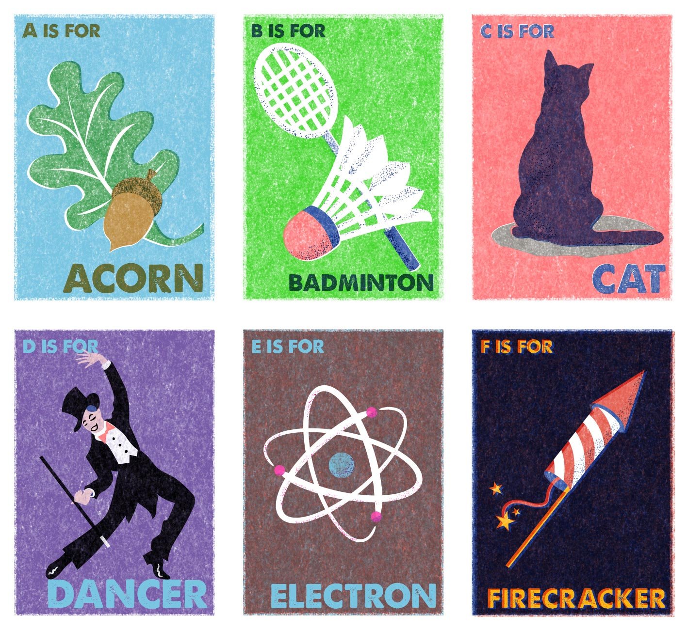
Behold the next instalment of my risoprint alphabet cards!
There are thirteen days between the completion of the letters A and O, and now that I see these arrayed like this, it’s very interesting to review the evolution of my style …
Behold the next instalment of my risoprint alphabet cards!
There are thirteen days between the completion of the letters A and O, and now that I see these arrayed like this, it’s very interesting to review the evolution of my style. The first six letters are quite stylised, with only minimal tonal shading, but with O especially I have gone all the way experimenting with the ‘wet on wet’ riso brushes, to more painterly effect.
I have tried to stick to minimal colour palettes on each illustration, to maintain the verisimilitude of real risoprinting, and the number of colours on each card ranges from 3–5. This is unlike the potato pancake recipe, which utilises about 12 colours, at least two of which aren’t ‘real’ riso ink colours, and would not be possible to recreate in a real risoprint. A purist might turn up their nose, but I am okay with that.
Eleven more to go!
Potato Palaver
I don’t often make Croatian style potato pancakes as it is a bit of a palaver, to be honest. Last week, however, I suddenly decided I would revisit my roots and make them. Subsequently, when I was brainstorming ideas to experiment with risoprinting effects, I thought it would be fun to create a step-by-step illustrated recipe to share – so here we are.
I don’t often make Croatian style potato pancakes as it is a bit of a palaver, to be honest. That comes from this modern style of cooking dinner where you arrive home from work, throw your hands up in the air in despair and throw whatever is in the fridge into a stir-fry, or salad bowl. Last week, however, I suddenly decided I would revisit my roots and make them.
Subsequently, when I was brainstorming ideas to experiment with risoprinting effects, I thought it would be fun to create a step-by-step illustrated recipe to share – so here we are. As legibility was important, I kept the texture to a minimum under the text, and did not include any misaligned registratation effects.
When researching potato pancake recipes – according to Professor Google – I found no one else in the world seems to make them using this same method. My friend suggested it was a secret family recipe, but while that’s an exciting notion, it can’t be true, as questioned, my mum said both her own mother and my dad’s Ukrainian mother made them this way. Also, it utilises the same dough as potato dumplings, the recipe of which is commonly known.
One of my sisters says she usually only makes these when she has leftover mashed potato, and suggested that perhaps grandmas all over the countryside did so, but never passed the method on. It seems odd to me. Surely other people hailing from that part of the world have done the same? If you have or know of anyone who has, please let me know! Otherwise, feel free to try the recipe out yourself.
Riso x Retro
It’s no secret that I have a long-held love of vintage style, which runs the gamut of fashion to homewares to photography. I’ve long experimented with various vintage effects in my illustration work as well, one of the features being incorporating interesting textures. In particular, I’ve loved the texture created in lithography, traditionally using stone as the drawing surface. More recently I became interested in Riso printing – a more modern technique that looks very vintage.
Interested in experimenting with the look at reasonable cost, I purchased some Riso printing effects for Photoshop from RetroSupplyCo, and for the last few days I have been having great fun playing with them!
In the meantime, I had also discovered Eastern European vintage matchbox labels on Pinterest, and I absolutely adored their stylised graphics, minimal colour palette and crude printing.
I have combined these two inspirations and applied them to some existing unpublished illustrations I created years ago, and also created some new pieces directly inspired by the matchboxes. I’m already planning the next trio in the alphabet series, and keeping my fingers crossed that I’ll be able to do some commercial work in this style in the future.


